| Image |
Comment |
| 12/16/2002 01:33:52 PM |
Strandedby kevinswopeComment by justine: Pretty rocks and water. Would of worked in the motion challenge also. I think the bottom could of been cropped off by 3/4 and the levels bumped up a bit. Nice shot. |
| 12/16/2002 02:00:22 AM |
Strandedby kevinswopeComment by Wes: The green mossy looking area on the rock in the dead center seems to be the focus of this picture, but my eye isn't drawn to that at all. Instead I find myself looking at the slightly fuzzy background. if the background were blurred more I think it would have turned out better. |
| 12/16/2002 01:37:54 AM |
|
| 12/14/2002 08:52:06 AM |
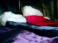
Christmas colorsby kevinswopeComment by Yellowpeep: I like the idea of this. However, when I look at the image, my eye doesn't know where to "rest". It seems, from my perspective, that there is a lack of focal point. I would love to see your outtakes of this challenge, and see if there is a photo that has more of a focal point. |
| 12/13/2002 01:07:40 AM |
Christmas colorsby kevinswopeComment by lisae: Hmmm... nice colours, lovely soft textures, and a nice interplay of light and shade. Although there isn't really a subject to this photo, it's kind of nice in an atmospheric, aesthetic and tactile way. Interesting idea. |
| 12/12/2002 09:12:51 PM |
Christmas colorsby kevinswopeComment by nards656: Even though I know all these are Christmas colors, perhaps its the particular shade of green in the background and the highlights on the purple that clash. I think this would have been improved with a light background and softer overall lighting. I also can't find a particular spot in the photo that really portrays sharp focus. If you worked really hard at this and I'm being too hard on it, I apologize :-) |
| 12/12/2002 04:38:11 PM |
Christmas colorsby kevinswopeComment by karmat: You have captured the texture of these stockings well. For some reason, I think if the red was in the middle it would seem more balanced to me. The purple and blue kinda run together, it seems. |
| 12/12/2002 01:09:22 PM |
Christmas colorsby kevinswopeComment by Swashbuckler: Nice colors, but where is your focal point? This might have worked better with more distance and a little zoom (distance increases your focal depth, too) A less obtuse angle might have helped this, too. (Straight on might be boring, but it will be fully in focus) 5 Swash |
| 12/12/2002 12:15:31 PM |
Christmas colorsby kevinswopeComment by crabappl3: Good concept. The reflected light in the back and the curtain not being all the way across the back, breaks the continuity of the shot. I think the DOF is appropriate for this photo, but I feel some post processing sharpening could have brought out the texture in the stockings better. |
| 12/12/2002 11:22:30 AM |
|
Home -
Challenges -
Community -
League -
Photos -
Cameras -
Lenses -
Learn -
Help -
Terms of Use -
Privacy -
Top ^
DPChallenge, and website content and design, Copyright © 2001-2026 Challenging Technologies, LLC.
All digital photo copyrights belong to the photographers and may not be used without permission.
Current Server Time: 07/16/2026 05:49:50 PM EDT.