| Image |
Comment |
| 12/06/2005 06:51:50 AM |
|
| 01/31/2003 05:58:57 PM |
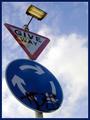
Tag! You're it.by DezComment by timj351: Critique Club critique
While the perpective certainly makes this photo an interesting one I feel a little uncomfortable with how much the left edge is being crowded. I would like to see the angle of the pole exaggerated even more so that the round sign is positioned on the right side with the top of the post in its same location to create an even more dynamic look and feel to the image. This positioning would also create triangular shapes in the negative space that would compliment the triangular sign. The reflection of the light bothers me a little as well and maybe the use of a polarizer filter could have reduced the reflection. You chose a good background that adds to the dramatic effect. The colors are good and overall the photo is very sharp and clean. The border does a nice job of presenting your photo without overpowering it. All and all you did a nice job with this photo.
Tim Jensen |
 Photographer found comment helpful. Photographer found comment helpful. |
| 01/31/2003 12:21:33 AM |
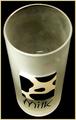
Not a dropby DezComment by sulamk: Greetings from the Critique Club
Subject
The subject is easily identifiable as a glass but I feel it would have, both looked and met the challenge better had it been at least half full of milk.
Sharpness: The image is nice and sharp which I feel is important to this single subject photo?
Exposure: Contrast & Color: I think the original exposure was probably more correct than it is now after photoshopping to get the background an even black. The mug now looks rather dingy and gray.
Composition I think the composition is good As you look at the photo you get an almost 3d effect of the mug you almost want to put your hand out and grab it! I liked your minimalistic approach to the challenge!
Suggestions for improvement
Milk in the cup! Better lighting and less adjustments in photoshop.
May I conclude by saying that I thought this would do better than it did!
|
| 01/28/2003 01:42:41 AM |
Tag! You're it.by DezComment by vestanpance: I'm really surprised that this one didn't do better. Ironic really that the grafitti that so many people didn't like was the whole point of the photo!! It was a shame that the reflection of the light was there though. |
| Photographer found comment helpful. |
| 01/26/2003 08:16:23 PM |
|
| 01/26/2003 12:06:48 PM |
Not a dropby DezComment by FranziskaLang: challenge met. interesting angle on the glass, nice even background. i wonder what this would've looked like with milk in the glass. the frosted glass looks a little dirty (even though i know it's only the frosting) and the milk would've covered that. |
| 01/26/2003 04:25:17 AM |
Tag! You're it.by DezComment by vestanpance: Nice viewpoint. The only thing I don't like about this photo is the reflection of the light on the Give Way sign, it's a shame that the light was on. |
| Photographer found comment helpful. |
| 01/25/2003 06:41:09 AM |
Not a dropby DezComment by bamaster: I like the idea of a frosted glass... gives a second dimension to the photo. Cool that you have a glass with the word Milk on it. |
| 01/24/2003 01:33:30 PM |
|
| Photographer found comment helpful. |
| 01/24/2003 09:45:44 AM |
Tag! You're it.by DezComment by joshua: the signs are too dark, the reflection of the light isn't a plus, the graffiti also takes away. this is a good example of how to use perspective to make your photo stand out against the sky |
| Photographer found comment helpful. |
Home -
Challenges -
Community -
League -
Photos -
Cameras -
Lenses -
Learn -
Help -
Terms of Use -
Privacy -
Top ^
DPChallenge, and website content and design, Copyright © 2001-2026 Challenging Technologies, LLC.
All digital photo copyrights belong to the photographers and may not be used without permission.
Current Server Time: 07/15/2026 09:54:56 PM EDT.