| Image |
Comment |
| 12/16/2002 12:44:20 PM |
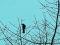
Unpruned melodyby JakComment by FranziskaLang: challenge met. you have picked a nice combination of busy twigs and also some empty space to frame the bird, i like that. also like that you have a nicely colored sky and that you caught the bird looking to the side. i don't like the processing you did to the photo so much, there's a slight "halo" around everything that suggests to me that maybe you sharpened the image just a tad too much. |
| 12/16/2002 11:14:29 AM |
|
| 12/16/2002 12:54:26 AM |
Unpruned melodyby JakComment by kandyj: I am not really wild about the abberations around the branches, maybe too much sharpening?? My olympus does this sometimes at full zoom. |
| 12/15/2002 12:29:34 AM |
|
| 12/14/2002 05:35:29 PM |
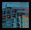
City Abstractby JakComment by jmsetzler: I do like the abstract nature of this shot... i also like the contrast between the colors as well. I think the overall image may be a little dark. It appears to be a tad noisy as well... I do love the lines and patterns here though... good work :) - setzler |
| 12/14/2002 09:41:28 AM |
City Abstractby JakComment by Yellowpeep: Great colors and abstract feel, and I like the frame too. The image itself seems a little grainy to me. |
| 12/12/2002 06:26:13 PM |
|
| 12/12/2002 01:35:31 PM |
|
| 12/12/2002 12:59:53 PM |
City Abstractby JakComment by karmat: The abstract part of this is awesome. I like the different "layers," for lack of a better word, of each of the sections. And the orange/red gives the appearance of fire. It is just real grainy to me, and I think a crisper picture would have been more effective.
Also, and this is just my opinion, the black in the border works well, but I think a wee bit more narrow would be better. |
| 12/12/2002 12:22:35 PM |
City Abstractby JakComment by lisae: I like the composition of this, and the colours. It's a really fetching abstract photo. The slight graininess is kind of nice, in my opinion. Photos that are very sharp sometimes seem harsh to me. However, I think the border is a bit too wide and dominates the photo rather than complimenting it. |
Home -
Challenges -
Community -
League -
Photos -
Cameras -
Lenses -
Learn -
Help -
Terms of Use -
Privacy -
Top ^
DPChallenge, and website content and design, Copyright © 2001-2026 Challenging Technologies, LLC.
All digital photo copyrights belong to the photographers and may not be used without permission.
Current Server Time: 07/16/2026 12:02:20 PM EDT.