| Image |
Comment |
| 07/20/2005 10:53:45 PM |
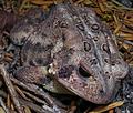
How Sad Is This!!by dphillipsComment by Jutilda: I love this but the fabric under his nose detracts. I wish it were a black color but I'm sure that wasn't possible. Love the eyes. Nice detail. |
 Photographer found comment helpful. Photographer found comment helpful. |
| 07/20/2005 09:55:47 PM |
|
| Photographer found comment helpful. |
| 07/20/2005 08:31:39 PM |
How Sad Is This!!by dphillipsComment by SJCarter: Nice capture. I can almost feel and smell him/her! I do think the crop is a little too tight - I'd like to see the end of his/her snout. It doesn't look like it was an artistic choice of crop at the bottom (I could be wrong), but the other crop sides are great. Nice colors too. |
| Photographer found comment helpful. |
| 07/20/2005 10:37:10 AM |
How Sad Is This!!by dphillipsComment by SandyP: Awwwwww. . . I love him!!! And even if he wasn't so cute to deserve a 10, the texture really is good on his face and ears. Good job. 10 |
| Photographer found comment helpful. |
| 07/12/2005 07:45:40 PM |
|
| 07/11/2005 12:02:18 PM |
Wartsby dphillipsComment by HBunch: Isn't he cute? I love toads and frogs and turtles. Not snakes though. Anyway...My first impression is that the DOF is off and I want to see his face in focus. However, realizing that the warts are your 'main focus' for the challenge, that wouldn't be a good idea. In order for the warts to be more of a main focus though, I might have gotten a closer shot of the warts and not even gotten the head of the frog. Maybe a horizontal line of warts/background, and that's it. The area in the lower right is distracting to me since it blends in with the little toad. As is, the circles just don't seem like the main focus. They ARE there though, so that counts for something. LIghting doesn't seem uniform across the image. Darker in the back and lighter in the front area. Maybe a different light could help accentuate the tiny warts. ~Heather~ |
| Photographer found comment helpful. |
| 07/11/2005 10:56:10 AM |
Wartsby dphillipsComment by SDW: Subject Impact: High
Meets Challenge: Low
Technical: Average
Composition: Average
Creativity: Average
Score: 5 |
| Photographer found comment helpful. |
| 07/10/2005 11:09:28 PM |
|
| Photographer found comment helpful. |
| 07/10/2005 07:57:03 PM |
|
| Photographer found comment helpful. |
| 07/09/2005 01:06:26 PM |
Wartsby dphillipsComment by HawesPhotoKC: I really don't feel that a circle is dominant here. It would also be a bit nicer to have the head in sharp focus. |
Home -
Challenges -
Community -
League -
Photos -
Cameras -
Lenses -
Learn -
Help -
Terms of Use -
Privacy -
Top ^
DPChallenge, and website content and design, Copyright © 2001-2026 Challenging Technologies, LLC.
All digital photo copyrights belong to the photographers and may not be used without permission.
Current Server Time: 07/17/2026 05:42:06 PM EDT.