| Image |
Comment |
| 10/01/2012 06:35:18 AM |
|
 Photographer found comment helpful. Photographer found comment helpful. |
| 09/09/2012 08:50:11 AM |
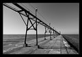
Grand Haven Lightby bmartuchComment by Tiny: Don't think you did anything wrong it is just not a very memorable scene and there were much better images.
I also think no border would be better. In one way it may all be a bit to clinical . |
| Photographer found comment helpful. |
| 09/08/2012 02:16:38 PM |
Grand Haven Lightby bmartuchComment by bassbone: Bob
First off, I love these lighthouses and especially your composition and delivery of these shots. The lines are excellent, and the low angle light to add shadows works great.
With that said, I see a couple things that probably cost you (I didn't vote on this challenge so I can't tell you how I felt at the time).
I understand why you interpreted your composition as 'off centered', with the light at the end being your subject. However, for the viewer, I think the subject is the entire pier and light, so in many ways, it is mostly centered, albeit riding across the image rather than dead center. In fact, the focus point is dead straight ahead rather than the light which is slightly out of focus due to the DOF.
In addition, the clear blue cloudless sky is working against you where the sky adds almost nothing to the image.
Finally, I think the strong border (the white line framing the thick black border) makes the frame look very think and overwhelming.
It is a very good solid shot, but it actually isn't your best work on these lights.
|
| Photographer found comment helpful. |
| 09/07/2012 02:30:49 PM |
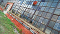
showing its ageby bmartuchComment by lawrysimm: Commenting for the critique thread - I see I gave this a 4 in original voting. For a free study I set the bar of expectation somewhat higher than normal and had this been in a relevant themed challenge it may well have been scored 5-6. Also with free study's moreso than any other, I adjust my votes based on the strength of the competition and tend to use the full range of 10-1 so you may have just been competing with a high standard of images that month.
The main issue for me is the leading lines throw my gaze immediately out of the frame to the left, so I have a hard time looking 'at' the image. Maybe being closer to the wall and having the lines go 'into' the frame rather than across it would hold my interest more.
I also found the colours to be a competing distraction - this may really benefit from a high contrast (or HDR) black and white treatment.
This shot just didn't do it for me. |
| Photographer found comment helpful. |
| 09/07/2012 02:02:08 PM |
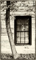
showing its ageby bmartuchComment by bassbone: I like the angles a lot, especially how you were able to keep the top window almost constant throughout.
I think the windows and the brick facing are gorgeous. The area where I am not sold on is the grass in the lower left. I wonder if a different perspective to only show the building may have had more impact, especially with the geometric focused crop.
To 'show the age' and have the natural surrounds still present, a more standard crop may have been in order. I think you were trying to do both at the same time and I am not sure it worked completely. Still, it got a 6 during voting from me. |
| Photographer found comment helpful. |
| 09/07/2012 01:20:55 PM |
showing its ageby bmartuchComment by littlemav: although I'm not a fan of leaning thingies.. this works, the part that really attracks me is the story's in the window panes.. I would have tried to crop to the panes.. and maybe you did and it didn't work, but that's my 2 cents... I do love your processing, not too much yet enought to punch it up |
| Photographer found comment helpful. |
| 09/06/2012 10:08:46 PM |
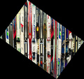
tis the seasonby bmartuchComment by EL-ROI: I am assuming you created the frame by rotating your shot thereby creating a bigger canvas size. High points for creativity and out of the box thinking but the frame does not add anything to this shot.
As for the shot it self, you did good to rotate the camera to get a more creative view on the subjects, however there is no other compositional elements in the shot to make it stand out. The shot is all background with no real depth. I do like all the lines of the skis but they do not serve to enhance a subject. Here the skis are the primary element of the shot when they should be the secondary element used perhaps as a background for an environmental portrait. |
| Photographer found comment helpful. |
| 09/06/2012 09:54:05 PM |
tis the seasonby bmartuchComment by MinsoPhoto: I see I gave this a 4. Pretty sure it was the border that dropped it below my average otherwise it would probably have been a 5 or 6. I'm just not a fan of these types of shots. Sorry not much of a critique. |
| Photographer found comment helpful. |
| 09/06/2012 07:28:11 PM |
tis the seasonby bmartuchComment by littlemav: Not that I am a border hater, but I would've liked this much better cropped just like it is an no border.. As it stood I see I gave it a 5... Funny think is when you posted this on the thread I remembered seeing it before so at least it made an impression, guess I ought to go back and bump that 5 to a 6 for sticking with me almost a year! |
| Photographer found comment helpful. |
| 09/06/2012 03:58:45 PM |
tis the seasonby bmartuchComment by Tommy_Mac: I really like the idea of this too, but as most had said the borders are what hurt it. I'ld actually like to see the picture as a whole without the border. |
| Photographer found comment helpful. |
Home -
Challenges -
Community -
League -
Photos -
Cameras -
Lenses -
Learn -
Help -
Terms of Use -
Privacy -
Top ^
DPChallenge, and website content and design, Copyright © 2001-2026 Challenging Technologies, LLC.
All digital photo copyrights belong to the photographers and may not be used without permission.
Current Server Time: 07/18/2026 03:37:49 AM EDT.