| Image |
Comment |
| 09/19/2005 09:23:12 PM |
|
 Photographer found comment helpful. Photographer found comment helpful. |
| 09/19/2005 09:12:02 PM |
|
| Photographer found comment helpful. |
| 09/18/2005 11:06:37 PM |
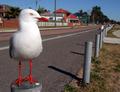
Bird on a Poleby owenComment by oOWonderBreadOo: hehe I like it. if I might say, the birds feet look almost too vibrant. It might be totally natural, just an observation. 7 :0) |
| Photographer found comment helpful. |
| 09/18/2005 06:37:48 AM |
|
| Photographer found comment helpful. |
| 09/16/2005 07:06:24 PM |
|
| Photographer found comment helpful. |
| 09/15/2005 04:07:13 PM |
|
| Photographer found comment helpful. |
| 09/15/2005 02:57:03 PM |
Bird on a Poleby owenComment by madison461: The first thing I see in this photo is some weird looking red legs, like the bird was cut and pasted there but then I notice the bird on the pole down the line. The red just seems too hot, oversaturated or sharpened. Neat capture however. |
| Photographer found comment helpful. |
| 09/15/2005 10:52:27 AM |
|
| Photographer found comment helpful. |
| 09/15/2005 06:27:39 AM |
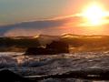
Lightwaveby owenComment by ubique: G'day Owen. Greetings from the Critique Club!
Odd co-incidence; my first CC critique and the shot was taken quite close to where I live.
The image is undeniably High Contrast, and yet it's not really that particular quality that first engages the viewer ... it's more the deft composition and the beautiful transluscent nature of the breaking wave top that establishes the initial impression. That slight subordination of the challenge theme is no bad thing, in my view. You have instead used High Contrast with more subtlety than most, as a natural extension of your vision for the subject. In other words you've avoided using High Contrast as a drunk uses a lamp post - for support rather than illumination.
Your composition is ultimately the most impressive and instructive aspect of the image. I applaud the fact that you have resisted placing either the rock or the sun at one of the classic 'thirds' intersections. Your photograph is all the more harmonious for that decision, because your slightly 'weaker' placement of those two elements means that attention is not unduly deflected away from the wave top. For the same reason, the placement of that wave top at the vertical half-way point is apposite - we therefore don't see the usual stretch of wet sand at the bottom or big sky with seagull at the top ... you knew exactly what your subject was, and you confidently eliminated everything that wasn't it! This is a fine image; beautiful and, if the viewer will take a few moments, also highly instructive. Among other things, it is a very powerful example of when it can be appropriate to bend the conventional compositional rules.
Cheers,
Paul Martin |
| Photographer found comment helpful. |
| 09/15/2005 12:01:30 AM |
|
| Photographer found comment helpful. |
Home -
Challenges -
Community -
League -
Photos -
Cameras -
Lenses -
Learn -
Help -
Terms of Use -
Privacy -
Top ^
DPChallenge, and website content and design, Copyright © 2001-2026 Challenging Technologies, LLC.
All digital photo copyrights belong to the photographers and may not be used without permission.
Current Server Time: 07/17/2026 02:47:41 PM EDT.