| Image |
Comment |
| 12/13/2002 12:37:37 PM |
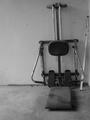
Last Year's Resolutionby myqylComment by kathleenm: I like the position of the exercise equipment in the frame, the dust is a good touch...but something about this isn't grabbing me. I'm sorry, I don't have any constructive suggestions, either. :-) |
 Photographer found comment helpful. Photographer found comment helpful. |
| 12/12/2002 11:27:32 PM |
Last Year's Resolutionby myqylComment by lisae: This is an interesting black and white study. I like all the dirt and grime, and the texturing on the wall and floor. It's an interesting commentary on our modern consumer society (if you want to get all cerebral about it :)).
It lacks something though. The photo is overall a little bit too grey, and I think I would like the shadows to be slightly longer and stronger to life the exercise equpiment from its surroundings more. The composition seems a bit too formal and static... some strong diagonal lines would help it along. Nice work though. |
| Photographer found comment helpful. |
| 12/12/2002 09:20:44 PM |
Last Year's Resolutionby myqylComment by nards656: Those resolutions from last year frustrate us all :-) I think this shot could have had a lot more perspective if some different angles had been included. I always try to think of how a commercial or a movie maker would portray things like this. Never flat. Always use some angles to pull the viewer's eyes to where you want it. A combination of vertical and horizontally adjusted angles can do a lot. I think you meant to use the rule of thirds, but it would have been more effective if the lines at the floor and walls pulled the viewer's eyes from the corners of the shot to the rule of thirds point. As well, don't ever let these jokers convince you that EVERYTHING has to use rule of thirds. That's bunk - it's just a guideline. Center it if you feel that's strongest. Good luck! |
| Photographer found comment helpful. |
| 12/12/2002 08:25:51 PM |
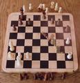
Baitby myqylComment by HBunch: A very cool shot. Definately showing the movement to take the piece. I like the angle and framing/cropping as well. The wood grain board looks good on the wood grain table, but the brown pieces kind of blend in a bit. Otherwise, focus and clarity are good. You have done a nice job. Good luck in the challenge. |
| Photographer found comment helpful. |
| 12/12/2002 06:50:44 PM |
Last Year's Resolutionby myqylComment by HBunch: Not really a overly thrilling image, however technically well done. I think that this has a good angle and framing/cropping. Focus and clarity are good, and the use of black and white is nice as well. Overall a well taken photo. Good luck in the challenge. |
| Photographer found comment helpful. |
| 12/12/2002 06:11:15 PM |
Last Year's Resolutionby myqylComment by Swashbuckler: Kinda familiar.....photo raises many questions, like what's the bar in the corner for? How is it useful at that position? Why framed like this? Why B&W?
7 Swash |
| Photographer found comment helpful. |
| 12/12/2002 04:50:07 PM |
|
| 12/12/2002 04:45:49 PM |
|
| Photographer found comment helpful. |
| 12/11/2002 11:15:33 PM |
Blew Bubbleby myqylComment by GeneralE: Originally posted by jmsetzler:
Greetings from the Critique Club :)
I believe from your challenge comments, we have already established the fact that she is cute, so I won't elaborate on that :)
...I read one of your comments mentioning a 'snapshot' quality about the image. What do you think about this? There are definite difference between your average family album shapshots and portrait photos. What could you have done differently with this subject to eliminate the 'snapshot' feel of the image? I am no expert on this subject, so I don't know either :)
Keep up the good work though :)
John Setzler |
John -- Thanks for sneaking in a hint of the Socratic method -- it's effective and "inoffensive."
myqyl -- I originally got my camera to shoot snapshots of MY cute kid, but had enough previous (graphic) art experience to try and make it possible to artistically "re-purpose" them.
The most prominent difference between snapshots and "artistic" photos seems to be cropping. This makes sense, since the purpose of the snapshot is usually to record the presence of a person/thing or event at a particular time and location, so there's usually a lot of background and context with a barely-recognizable subject. In more arty photos of people or things, most photographers crop away almost all the background, or make it neutral, or otherwise de-emphasize it versus he subject.
This frame doesn't leave much to crop. If I were to re-shoot it, I would definitely capture the frame with her hand up by her face and the bubble in the process of emerging, from a position about 15 degrees to the left of where you took this one, and maybe even lower. You'd see her eyes, as John mentioned, but they'd be twisted down and in as she concentrates on the bubble (no reflection if you want to use the flash). You'd be able to crop to the back of her hand on the left, her hair on the top and right, and to her elbow on the bottom.
Send me an email if you want to discuss the Art of the Snapshot outside of DPC, and exchange examples...
--Paul Message edited by author 2002-12-11 23:16:41. |
| Photographer found comment helpful. |
| 12/11/2002 10:57:20 PM |
Baitby myqylComment by ChrisW123: Nice idea, but it's not clear as to what "bait" means... I know because I play chess but most won't know... By sacraficing the Black Bishop (taken by the White Knight), you clear the way for the Black Rook to checkmate the White King. :) Right? Very clever. You get an 8 for this. |
| Photographer found comment helpful. |
Home -
Challenges -
Community -
League -
Photos -
Cameras -
Lenses -
Learn -
Help -
Terms of Use -
Privacy -
Top ^
DPChallenge, and website content and design, Copyright © 2001-2026 Challenging Technologies, LLC.
All digital photo copyrights belong to the photographers and may not be used without permission.
Current Server Time: 06/22/2026 01:26:54 PM EDT.