| Image |
Comment |
| 01/20/2003 10:21:22 AM |
Go Away!by myqylComment by tomzinho: looks like a chasity belt protecting the garden of eden. would have liked to see the red and greens seem a little sharper (increase the saturation in post processing) |
 Photographer found comment helpful. Photographer found comment helpful. |
| 01/20/2003 06:11:07 AM |
Go Away!by myqylComment by paynekj: The sign looks a little "washed-out". Increasing the contrast might have helped. |
| Photographer found comment helpful. |
| 01/20/2003 04:47:53 AM |
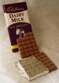
Milk's Perfect Formby myqylComment by inspzil: You should've ironed your backdrop cloth. I think the lighting needs to be a bit brighter as well. - Inspzil |
| Photographer found comment helpful. |
| 01/20/2003 01:39:56 AM |
Go Away!by myqylComment by Malokata: Certainly unfriendly. I think this would have been more effective at a little less of an angle to the sign. |
| Photographer found comment helpful. |
| 01/20/2003 12:16:10 AM |
Milk's Perfect Formby myqylComment by Turbotech: Intresting. Reshoot this with a White scrim or a white deflector on the right side to give a light ratio of 2:1. I think you will be surprised. |
| Photographer found comment helpful. |
| 01/19/2003 07:04:56 PM |
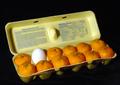
Laying Lowby myqylComment by psychephylax: A visit from the Critique Club :)
Wow, this made me laugh. I think these types of photos were quite popular for this challenge. But I suppose this was the challenge!
I am not sure which way would have worked better 11 eggs/1 orange or 11 oranges/1 egg. I can see why this is stranger, but I would consider "land" to be the crate and eggs as native inhabitants of that land with one solo orange being the outsider.
Lighting on this photo is pretty good but I think it could be done a bit better without shadows at all. Also the oranges on the right seem to be a slightly less lighted than the ones in the foreground.
I like the composition of the egg crate being slightly on an angle. Also the lines provide some good contrast to the curvy eggs.
The black background is perfect for this photo. It brings all attention to the carton.
I think this is a very well executed photo. |
| Photographer found comment helpful. |
| 01/13/2003 03:33:21 AM |
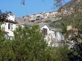
Little Boxesby myqylComment by Natasha: Critique Club
Content-Composition
I am afraid the content of this is a little lost on me cause I haven't heard of the song. I like the composition of the picture, with the lines of the houses meeting each other. However the houses at the bottom seem to get a bit lost behind the trees, maybe a higher view point would have included more of the actual houses.
Background
Eyes are drawn to the backhround more than to the foreground, everything is nice and sharp so this helps.
Technical
Focus is good here, with both the foreground and background equally sharp. Colour saturation is good, perhaps a little more contrast would bring out the blue of the sky more and add a bit more green to the trees.
My opinion
Unfortunately I don't know the song, so I can't relate to the picture. On it's own, it is a nice picture but I think it needs a bit more interest. I wonder if more sharpening would add impact. Good Luck in the next challenge. |
| Photographer found comment helpful. |
| 01/13/2003 12:01:13 AM |
|
| Photographer found comment helpful. |
| 01/12/2003 07:35:59 PM |
|
| 01/11/2003 07:40:43 PM |
|
Home -
Challenges -
Community -
League -
Photos -
Cameras -
Lenses -
Learn -
Help -
Terms of Use -
Privacy -
Top ^
DPChallenge, and website content and design, Copyright © 2001-2026 Challenging Technologies, LLC.
All digital photo copyrights belong to the photographers and may not be used without permission.
Current Server Time: 06/22/2026 07:24:15 AM EDT.