| Image |
Comment |
| 01/27/2003 01:24:49 PM |
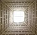
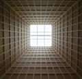
SkyLight ^ 2 by myqylComment by Paige: Very cool. The squares at the bottom look a little wider then the ones up top, were you exactly centered underneath? I think it would be a little stronger if it were totally symetrical, but still a strong shot. |
 Photographer found comment helpful. Photographer found comment helpful. |
| 01/27/2003 12:20:39 PM |
SkyLight ^ 2by myqylComment by calaille: Red leader, this is Voodoo 1, we're not gonna make it... ***static***...we need some back up Luke....
Great Picture! 9 |
| 01/27/2003 12:08:21 PM |
SkyLight ^ 2by myqylComment by dadas115: This is one of my favorites for this week. There are some blown out spots in the center of the picture but I am sure these are intentional, and they work very well in this case. I like the way the light is radiating in and the intensity drops off as you get closer to the edges. The lines are very strong and almost give me a sense of motion towards the light. I wouldn’t change anything about this shot. You have made an uninteresting (to me at least) topic interesting.
Greg
|
| Photographer found comment helpful. |
| 01/27/2003 11:01:54 AM |
|
| 01/27/2003 09:44:23 AM |
|
| 01/27/2003 09:18:40 AM |
|
| Photographer found comment helpful. |
| 01/27/2003 07:54:00 AM |
|
| 01/27/2003 04:14:09 AM |
Go Away!by myqylComment by SharQ: (Critique Club)
I am nut quite sure what is going on in this image. On my monitor (well, both my monitors, actually, so I don't think it is the monitors fault), the lines look jagged. Both the cirvle on the sign, the line through it, the wooden stakes in the background... Etc. Also, I have the most serious doubts in the world if this sign was taken on f/4.0. The background - and several meters behind - are completely in focus. The only way this could have been taken with f/f is if you were standing very far away from the sign.
My tip would have to be: Go a lot closer, use your widest (i.e smallest number) aperture, and throw shte background out of focus that way. You also write that you used unfamiliar tools, and my tip for that would be.. eh.. don't ;) That is probably the reason for the jaggedness.
When all of that is whined about; Interesting composition, and great contrast in colours.. Good work. |
| Photographer found comment helpful. |
| 01/27/2003 03:16:09 AM |
|
| 01/27/2003 02:56:58 AM |
|
Home -
Challenges -
Community -
League -
Photos -
Cameras -
Lenses -
Learn -
Help -
Terms of Use -
Privacy -
Top ^
DPChallenge, and website content and design, Copyright © 2001-2026 Challenging Technologies, LLC.
All digital photo copyrights belong to the photographers and may not be used without permission.
Current Server Time: 06/22/2026 07:26:55 AM EDT.