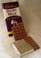
Milk's Perfect Formby
myqylComment by kandyj: Critique Club comments:
As noted below, I liked this shot when I first saw it.
Composition: Good, I like the way the eye flows downward with the milk into the chocolate. Yes, the middle candy could have been scooted over a bit to the right or left to avoid lining up with the wrapped bar, although you would have needed to take another bite, ha! If the bottom piece was a bit more angled, it might have made the composition a little more interesting.
Creativity: The best feature of this shot. Loved the milk flowing into the candy and is a great idea for this challenge!
Technical quality: fair The wrinkles are a bit distracting, but I really liked the way the color of the backdrop worked with the colors in the wrapper and the very soft lighting. The chocolate crumb could have been removed for a cleaner look. Would have liked a little less lighting on the foil, and a tad more on the words on the wrapper. As noted above, the background colors work well with the shot and help bring the focus to the candy, as well as the contrast in the shot.
Overall: This is a fairly nice shot, shows that maybe you rushed a bit to get it done and from your comments I can see why and understand the technical flaws.
Hope this helps!