| Image |
Comment |
| 06/16/2003 10:46:40 AM |
|
 Photographer found comment helpful. Photographer found comment helpful. |
| 06/16/2003 04:59:37 AM |
|
| 06/16/2003 01:45:22 AM |
|
| Photographer found comment helpful. |
| 05/20/2003 11:05:16 PM |
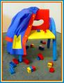
Primary Coatrackby myqylComment by wewillexplore: Greetings from the Critique Club
Hi Mike!
Composition
The legos are so messy and the jacket is hung up so nice and neat. I'd have knocked the chair over, strewn the jacket on the ground and had a kid passed out in the middle...but that's just me! lol Anyways - it's a good setup here.
Color
Unreal beautiful colors! I even like the border, as I said in my comment during the challenge!
Lighting
I like it - except for the diagonal shadow along the left. Too bright and you blow this shot out, too dark and the vibrancy is lost from the colors - beautiful medium here!
Subject matter
When I think bright colors, and primaries, I think children too - good setup, obviously meets the challenge, and does it very well.
Overall
Congrats on the pic and the above average score. Keep shooting!
Mav
|
| Photographer found comment helpful. |
| 05/18/2003 11:47:18 PM |
Primary Coatrackby myqylComment by karmat: I love the composition of this shot, but I think if you could have placed a solid color (white or black perhaps) under the chair and toys, it would have been more effective. The color of the carpet seems to take away from the strength of the primaries. Also, on a side note, and not related to your score at all, the broad yellow band in your border really pulls the eyes out of the picture. Maybe if the red and yellow were reversed. |
| Photographer found comment helpful. |
| 05/18/2003 11:27:36 PM |
For Mother's Dayby myqylComment by ClubJuggle: *Critique Club*
FIRST IMPRESSION: A bit busy in the foreground, and I don't like the font.
CHALLENGE: Meets the challenge.
COMPOSITION: Perhaps the most bothersome items in this image are tha man in the foreground whose feet are cut off, and the abandoned chair and other items. Other than that this is a pretty good shot.
TECHNICAL: Though this could be a trick of perspective the shot does seem tilted slightly counterclockwise. Exposure and color are good, however.
CONCLUSION: A good shot, unfortunately the items that could have made it better were largely out of your control.
Thanks for sharing and good luck in future challenges! |
| Photographer found comment helpful. |
| 05/18/2003 10:48:57 PM |
Primary Coatrackby myqylComment by HBunch: This is cute, and definately fits the challenge. I think the border is a little overkill though. Focus, and lighting appear to be good. I do wish though that there could have been a bit more lighting under the chair as to not mute the colors of the blocks under the chair. Otherwise, a nice job! ~Heather~ |
| Photographer found comment helpful. |
| 05/16/2003 06:52:54 AM |
Primary Coatrackby myqylComment by kiwiness: Wow now there are a lot of primary colors in this pic :-) What I particularly like is that all the colors are the same tone of that color, good! |
| Photographer found comment helpful. |
| 05/15/2003 11:22:18 PM |
Primary Coatrackby myqylComment by dacrazyrn: Great concept. Focus looks good. I think maybe taking the shot from lower angle and shooting up to have the white wall behind it and get the grey carpet out would have given more impact. Doesn't affect the score, but the border is hideous! |
| Photographer found comment helpful. |
| 05/15/2003 11:33:21 AM |
Primary Coatrackby myqylComment by wewillexplore: Such a childlike atmosphere in this shot. The border really ADDS to this pic - and that's saying something. Excellent use of availables! |
| Photographer found comment helpful. |
Home -
Challenges -
Community -
League -
Photos -
Cameras -
Lenses -
Learn -
Help -
Terms of Use -
Privacy -
Top ^
DPChallenge, and website content and design, Copyright © 2001-2026 Challenging Technologies, LLC.
All digital photo copyrights belong to the photographers and may not be used without permission.
Current Server Time: 06/21/2026 01:31:13 PM EDT.