| Image |
Comment |
| 09/24/2007 05:35:23 PM |
|
 Photographer found comment helpful. Photographer found comment helpful. |
| 09/23/2007 11:41:27 PM |
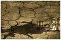
Droughtby SDWComment by lovethelight: wow the composition is cool and i love the idea that you put across. i love how glassy smooth the bottle looks |
| Photographer found comment helpful. |
| 09/23/2007 11:40:24 PM |
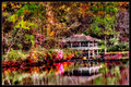
Impressionismby SDWComment by lovethelight: what an awesome location! I think that the top half is a bit too sharp though, i LOVE the effect that is achieved in the water and if the top half could be not quite as sharp and harsh this would be perfect |
| Photographer found comment helpful. |
| 09/23/2007 11:39:22 PM |
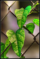
Vineby SDWComment by lovethelight: i love the drops on the leaves, the top left hand corner is so distorted/unrealistic that it doesn't seem to go with the rest of the photograph |
| Photographer found comment helpful. |
| 09/23/2007 11:39:22 PM |
Vineby SDWComment by lovethelight: i love the drops on the leaves, the top left hand corner is so distorted/unrealistic that it doesn't seem to go with the rest of the photograph |
| Photographer found comment helpful. |
| 09/23/2007 11:35:08 PM |
Droughtby SDWComment by Yo_Spiff: I like the texture and the glint off the bottle. A little bare, maybe. My eye tends to go up toward the upper portion, rather than to the bottle and spill. |
| Photographer found comment helpful. |
| 09/23/2007 11:29:42 PM |
Vineby SDWComment by Yo_Spiff: The colors are enhanced almost to the point of not looking like a photo anymore. However, You were clearly going for the look, not realism. The fringe showing on the leaf on the far right is a little out of place. Otherwise, it's very nice stuff. Message edited by author 2007-09-23 23:31:21. |
| Photographer found comment helpful. |
| 09/23/2007 09:52:43 PM |
Impressionismby SDWComment by pcody: I love how the colors run into each other in the reflection. It's probably because it had to be downsized, but the effect in the top looks to harsh to me. The only color I feel is over saturated is the pink of the bush over the water. The other colors look rich but appropriate. |
| Photographer found comment helpful. |
| 09/23/2007 09:29:35 PM |
Vineby SDWComment by Jutilda: Almost like a painting. I love the intense green against the diamond pattern of the fencing. |
| Photographer found comment helpful. |
| 09/23/2007 08:25:21 PM |
Impressionismby SDWComment by Tlemetry: This one is very busy for me. But I love the painterly effect you were going for here. I agree the saturation is a bit strong. The subject, composition and water reflection is FANTASTIC!
|
| Photographer found comment helpful. |
Home -
Challenges -
Community -
League -
Photos -
Cameras -
Lenses -
Learn -
Help -
Terms of Use -
Privacy -
Top ^
DPChallenge, and website content and design, Copyright © 2001-2026 Challenging Technologies, LLC.
All digital photo copyrights belong to the photographers and may not be used without permission.
Current Server Time: 06/19/2026 12:32:58 AM EDT.