| Image |
Comment |
| 10/06/2002 08:57:00 AM |
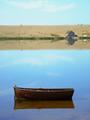
Don't Pay The FerryManby MartinComment by KarenB: Initial=very nice! Composition=This is tricky..... Since my eye goes right to the little house on the sand, and then to the boat, I am wondering if the amount of sky used in the frame is needed. It makes me feel there is a brown stripe almost in the center of the shot... I have tried to visually crop it to see if a different crop would improve or destroy your image.... Hmm. I cropped it in photoshop to just above the sand dune, and to just to the right of the house.. Makes the house more pronounced, and leads the eye down the photo to the boat in a smoother way I think... Tough call, but I think so. Clarity (focus, details)=details are wonderful Exposure=great Interesting or Emotive=interesting and emotive I am using a this new detailed commenting method inspired by autool. (Thanks autool!). I hope you find it helpful. Thanks for submitting, and good luck! ;0) |
| 10/05/2002 05:47:00 AM |
|
| 10/04/2002 11:48:00 PM |
|
| 10/04/2002 03:45:00 PM |
Don't Pay The FerryManby MartinComment by Swashbuckler: Very nice photo. It kinda reminds me of a famous painting, but I don't remember either the title or the painter. Great title, color, focus...nice job! 9 Swash |
| 10/04/2002 02:57:00 PM |
|
| 10/04/2002 10:57:00 AM |
Don't Pay The FerryManby MartinComment by Kavey: Beautiful! Great composition with the boat and the little building very well balanced. If we didn't have to restrain ratio, I'd crop a little more sky off the top. Very nice photo. 8, Kavey |
| 10/02/2002 11:02:00 PM |
|
| 10/02/2002 10:57:00 PM |
Don't Pay The FerryManby MartinComment by camelotnorth: nice composition..like the way the boat balances out the house and beige setting..very lonely and yet I think I see a car coming over the horizon |
| 10/02/2002 03:39:00 PM |
|
| 10/02/2002 12:50:00 PM |
|
Home -
Challenges -
Community -
League -
Photos -
Cameras -
Lenses -
Learn -
Help -
Terms of Use -
Privacy -
Top ^
DPChallenge, and website content and design, Copyright © 2001-2026 Challenging Technologies, LLC.
All digital photo copyrights belong to the photographers and may not be used without permission.
Current Server Time: 07/17/2026 07:08:47 AM EDT.