| Image |
Comment |
| 09/15/2005 02:33:25 PM |
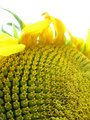
100_0084.jpgby ajschelComment by SJCarter: Very interesting perspective and DOF. I would consider cropping it tighter at the top (to minimize the blown out sky yet maintaining just a hint of it). I like the colors too. I probably would have scored it a 6. |
 Photographer found comment helpful. Photographer found comment helpful. |
| 09/15/2005 01:52:49 PM |
100_0084.jpgby ajschelComment by ShannonLee: this is way cool!i love the detail and the colors! the only thing i don't care for it that the end of the petals look a little blurry or something |
| Photographer found comment helpful. |
| 09/15/2005 01:39:54 PM |
|
| Photographer found comment helpful. |
| 09/15/2005 04:33:04 AM |
100_0084.jpgby ajschelComment by madison461: I like it! The nature macros are very popular entries but I think they are too "safe". IMHO, the challenge is to create a shot that skews perspective and messes with your brain. This shot would fit the challenge but not pique my interest as much as someone that has a King Kong sized dog that looks ready to eat the little (but looks full grown) person.
This is a nice macro shot and the angle taken of the center of the sunflower, showing the rows, definitely meets the challenge rules. We have a lot of good macro shooters here! |
| Photographer found comment helpful. |
| 09/14/2005 07:09:12 AM |
|
| Photographer found comment helpful. |
| 09/14/2005 03:45:32 AM |
|
| Photographer found comment helpful. |
| 09/12/2005 04:47:11 PM |
Still feeling twiggyby ajschelComment by stek: This picture is kind of hard to tell the difference b etween the actual branch and the other stuff behind it. Nice job. |
| Photographer found comment helpful. |
| 09/11/2005 11:52:58 PM |
|
| Photographer found comment helpful. |
| 09/11/2005 10:20:07 PM |
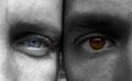
Eye Contrastby ajschelComment by Tammer: I like the play on words with your title. If the eyes had been a bit brigher I would have scored them higher. Nice compositiona and closeup. |
| Photographer found comment helpful. |
| 09/11/2005 08:02:39 PM |
Drugs & Liquorby ajschelComment by Jutilda: Greetings from the Critique Club~ :~)
My first thought on this photo is that it has good composition and the title is certainly fitting of the challenge. I think that the main problem is the lighting which creates under exposure and quality of the shot. You could have even shown a spotlight on them from an angle and added to not only the ability to see them, but added another element of interest.
If the items were placed on a white or black surface, the grain of the wood of the table would have been less of a distraction. The varying heights are good and the fact that you have an odd number of items works better since they don't have a specific placement value. It would have served you better had there been more negative space on either the right or the left of the collection of items. I might've even had a bit more on top as well. It looks a bit tight, cropped as it is.
You could have possibly taken advantage of more post editing tools as this was an Advanced Editing challenge. The imagination is there, so maybe if it were tweaked, this might have a winning combination.
Hope you find this helpful! All the best, Judy |
| Photographer found comment helpful. |
Home -
Challenges -
Community -
League -
Photos -
Cameras -
Lenses -
Learn -
Help -
Terms of Use -
Privacy -
Top ^
DPChallenge, and website content and design, Copyright © 2001-2026 Challenging Technologies, LLC.
All digital photo copyrights belong to the photographers and may not be used without permission.
Current Server Time: 07/17/2026 03:49:35 AM EDT.