| Image |
Comment |
| 09/21/2005 05:05:41 AM |
|
 Photographer found comment helpful. Photographer found comment helpful. |
| 09/20/2005 11:04:59 PM |
|
| Photographer found comment helpful. |
| 09/20/2005 07:31:13 PM |
|
| Photographer found comment helpful. |
| 09/19/2005 08:07:41 PM |
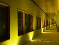
A different perspectiveby ajschelComment by Tammer: I'm not crazy about the overwhelming yellow hue (but you might not have been able to help that). I do like the perspective you captured. |
| Photographer found comment helpful. |
| 09/18/2005 10:18:20 PM |
|
| Photographer found comment helpful. |
| 09/17/2005 05:34:56 PM |
A different perspectiveby ajschelComment by typologic: I really like this. The lighting gives this a great moody feel. The only thing that would have made it better is a model walking down the hallway. |
| Photographer found comment helpful. |
| 09/16/2005 07:24:48 PM |
|
| Photographer found comment helpful. |
| 09/16/2005 02:01:28 PM |
IMG_6463.jpgby ajschelComment by SJCarter: I'm not sure that I agree with the tighter crop perspective. I think that the enormity of the adverts plastered all over the wall really illuminate the smallness and relative inconsequential nature of the lone, struggling guitarist. I do agree that it's a lot of information and color for the viewer to take in. Have you considered a selective desat to show the musician and his "wares" in full color and perhaps a muted tonal version of the signs and B/W for everything else? Or perhaps just a few of the signs in color? Just a thought... My thinking was that 1) you wouldn't need to crop the shot and lessen the impact of the musician's plight, 2) you could bring the viewer's focus back to the musician, and 3) you could "highlight" (but not overwhelm) the competition. Just my 2 cents on a good shot as is. :-) |
| Photographer found comment helpful. |
| 09/16/2005 01:35:39 PM |
100_0084.jpgby ajschelComment by GreenGiant: I like the angle and DOF here, aswell as the subject they are all great I think a blue sky background would have really made this photo for me.
GG |
| Photographer found comment helpful. |
| 09/15/2005 05:46:33 PM |
IMG_6246.jpgby ajschelComment by brianlh: I think the heavy shadows here and lack of interesting color (to me, at least) leaves this as a good candidate for conversion to Black and White. |
| Photographer found comment helpful. |
Home -
Challenges -
Community -
League -
Photos -
Cameras -
Lenses -
Learn -
Help -
Terms of Use -
Privacy -
Top ^
DPChallenge, and website content and design, Copyright © 2001-2026 Challenging Technologies, LLC.
All digital photo copyrights belong to the photographers and may not be used without permission.
Current Server Time: 07/16/2026 11:53:55 PM EDT.