| Image |
Comment |
| 03/19/2005 07:06:43 AM |
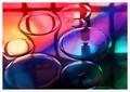
Out at Seaby JeanComment by dahkota: Wow. The colors are excellent. I love the two competing blues - they work well together. Focus, POV, DOF excellent. 10 |
 Photographer found comment helpful. Photographer found comment helpful. |
| 03/18/2005 05:26:44 PM |
First Impressionby JeanComment by srbrubaker: This really is quite and extraordinary shot. I love the colors and the layers of space: the layer under the fluid, the fluid, the floating fluid, and the reflected image. It's like four parallel worlds. |
| Photographer found comment helpful. |
| 03/18/2005 01:25:49 PM |
|
| Photographer found comment helpful. |
| 03/18/2005 03:57:24 AM |
Out at Seaby JeanComment by Bud: Very appealing... the silouette works great with the colors of the boat and the reflection of the water...9. |
| Photographer found comment helpful. |
| 03/17/2005 01:54:36 PM |
Out at Seaby JeanComment by magnon: Hmm... This image's lines could be interpreted in many ways, and I'm not sure what you've been thinking of whenyou made it. However, the central part of the image is almost black, and not black enough to make a silhouette. It'll be interesting to see what you've thought of with this image. |
| Photographer found comment helpful. |
| 03/16/2005 01:03:11 PM |
Out at Seaby JeanComment by nards656: I really like this, but somehow I wish the water weren't QUITE so blue. Just a little. The boat and the person are perfect. 7 |
| Photographer found comment helpful. |
| 03/14/2005 05:13:49 PM |
|
| Photographer found comment helpful. |
| 03/14/2005 02:53:21 AM |
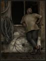
Out at Seaby JeanComment by Bear_Music: This is a stunningly nice image that only marginally, IMO, adresses the challenge. It's too nice not to give a good score to, since the diagonal pole does add a strong line element. Hellof a nice shot. |
| Photographer found comment helpful. |
| 03/14/2005 12:55:13 AM |
|
| Photographer found comment helpful. |
| 03/07/2005 10:32:39 AM |
Taking a breakby JeanComment by gloda: You're right the image is dark, but I guess that's the way it should be? Feels right. I agree with bear_music, the face should be brighter to put emphasis on it, make it stick out a bit more against the background. |
| Photographer found comment helpful. |
Home -
Challenges -
Community -
League -
Photos -
Cameras -
Lenses -
Learn -
Help -
Terms of Use -
Privacy -
Top ^
DPChallenge, and website content and design, Copyright © 2001-2026 Challenging Technologies, LLC.
All digital photo copyrights belong to the photographers and may not be used without permission.
Current Server Time: 07/25/2026 12:39:20 AM EDT.