| Image |
Comment |
| 12/25/2002 01:56:44 PM |
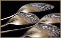
Reflectionsby JeanComment by carsten: My favourite this week. Everything is splendid: composition, colours, focus and border. Well done! Hope you win. |
| 12/24/2002 07:05:13 PM |
Reflectionsby JeanComment by PTLParsons: What is this reflections of? Flower pot pebbles? This is absolutely beautiful. I just wish you had not cropped of the ends of the two spoons. I would rather you cropped off some of the handles. But I'm still trying to figure out how you did this unless you turned the picture upside down after taking the photo from the bottom side as you held the spoons over a bowl of pebbles. I just think I came up with a way to do it. This is a 10 in my book, and I bet a lot of others too. PTL |
 Photographer found comment helpful. Photographer found comment helpful. |
| 12/24/2002 03:29:29 PM |
Reflectionsby JeanComment by Bullwinkle: This image has a beautiful pleasant warm metal feel. I like that as opposed to the frequent cold metal touch. The pebbles repeat the spoon curves appropriately.The juting corner is an interesting contrasting visual element. There seem to be at least three colours in that polygon bit. Personally I would prefer just one simple tone instead of those three. If you make a roof cone of translucent sheet above your subject this could eliminate all distracting room elements ( if you had wished to do so ) . I also would have eliminated the bluish marbles. Just brownish rocks for my personal tastes. I also like how you overlapped portions of the spoons. In heaven I would magically arrange it so that the dark spoon edge would overlap the adjacent handle but the clear shiny edge between adjacent bowls would not touch. These are just minor suggestions in an otherwise gorgeous image. Thank you for aiming high for originality. ...7 |
| Photographer found comment helpful. |
| 12/24/2002 01:37:22 PM |
|
| 12/23/2002 07:52:51 PM |
Reflectionsby JeanComment by sylandrix: Very neat abstract, almost seems like jellyfish at the bottom of a deep ocean :) jpg could have been at a better quality, or perhaps the artifacts are a product of oversharpening? Can't tell the difference yet... nice shot! |
| Photographer found comment helpful. |
| 12/23/2002 01:19:52 PM |
|
| 12/08/2002 11:40:13 PM |
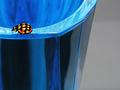
Lady on Blueby JeanComment by timj351: The lady bug looks too perfect like it is cut out. This is a very clean and colorful image. I would prefer to see the lady bug walkinto the picture instead of out of it. |
| 12/08/2002 09:08:16 PM |
|
| 12/06/2002 06:53:25 AM |
|
| 12/05/2002 09:40:39 PM |
|
Home -
Challenges -
Community -
League -
Photos -
Cameras -
Lenses -
Learn -
Help -
Terms of Use -
Privacy -
Top ^
DPChallenge, and website content and design, Copyright © 2001-2026 Challenging Technologies, LLC.
All digital photo copyrights belong to the photographers and may not be used without permission.
Current Server Time: 07/24/2026 12:04:02 AM EDT.