| Image |
Comment |
| 02/23/2003 09:16:25 AM |
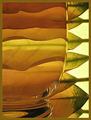
Harmonyby JeanComment by jjbeguin: Nice patterns especcially in the glass part, I regret the brown frame that blends everything together. Try replacing it with a white one, it will separate the volumes and amplifie the rythm. 9 |
 Photographer found comment helpful. Photographer found comment helpful. |
| 02/23/2003 12:47:04 AM |
|
| Photographer found comment helpful. |
| 02/23/2003 12:00:21 AM |
|
| 02/22/2003 08:00:46 PM |
|
| 02/22/2003 07:52:40 PM |
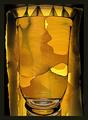
Shades of Yellowby JeanComment by JPR: Very interesting and artistic. I picked out your rhythm one as well but I can't vote since I'm not a member. It was great too. 7 |
| 02/22/2003 07:21:00 PM |
Harmonyby JeanComment by Azrifel: Excellent composition. Wonderful how the leafes work out when refracted by the water. Wonderful flowing curves and great gradations of colors. This one is 200% better as the yellow entry. |
| Photographer found comment helpful. |
| 02/22/2003 05:33:24 PM |
Harmonyby JeanComment by smellyfish1002: Congrats! My only 10 for this challenge. I thought it was a really cool abstract at first, but I quickly realized it consists of a glass and some plant leaves, on mirror/glass. A very nice set up, very clever and very appealing color and tone. Your focus, DOF, clarity of detail, lighting, etc are all perfect. There appears to be some falloff of DOF from the glass to the leaves, but I like that. I think it helps the photo, rather than having the leaves crisp and sharp. The patterns created in the liquid are wonderful. The only thing I don;t like about this shot is the border you chose. Yes, that color reflects similar colors in the image, but because of that, the border appears very weak and flat to me. The dark green in the leaf on the bottom right might have been a better choiice of color for the border, IMHO. I won't knock your score for a border, though. Everything else is perfect! Great job! 10
JD Anderson |
| Photographer found comment helpful. |
| 02/21/2003 03:13:33 PM |
|
| Photographer found comment helpful. |
| 02/20/2003 11:42:43 PM |
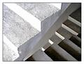
Steps in the right directionby JeanComment by karmat: CRITIQUE CLUB CRITIQUE
by karmat
COMPOSITION
Great choice of subject matter. I really like the flow of the diagonal lines, and how they set up contrasts by going in different directions. The brightness of the top steps really grabs the viewer's eyes, so it may have been more effective to have less of them and more of the bottom steps, then the eyes would travel through the picture more easily.
TECHNIQUE
The focus is good, and the lighting overall establishes some nice tonal contrast. I think the upper part is a bit bright, but it would be difficult to tone that down without losing some in the lower sections. You have captured the textures of the steps very well.
OVERALL EFFECT
I love the optical illusion of this one. It is confounding enough to make you look at it for a few seconds more, then it just pops out at you. It looks so 2-dimensional, and 3-dimensional, at the same time. Overall, very nicely done. |
| Photographer found comment helpful. |
| 02/20/2003 09:20:15 PM |
Harmonyby JeanComment by Natasha: This is a fantastic shot! Great colours, beautiful rhythm and very original! Good Luck |
| Photographer found comment helpful. |
Home -
Challenges -
Community -
League -
Photos -
Cameras -
Lenses -
Learn -
Help -
Terms of Use -
Privacy -
Top ^
DPChallenge, and website content and design, Copyright © 2001-2026 Challenging Technologies, LLC.
All digital photo copyrights belong to the photographers and may not be used without permission.
Current Server Time: 07/26/2026 05:59:00 AM EDT.