| Image |
Comment |
| 10/12/2004 11:38:41 PM |
|
 Photographer found comment helpful. Photographer found comment helpful. |
| 10/12/2004 04:00:57 PM |
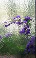
A Bit of a Paneby biggood53Comment by LN13: The window frame (?) on the right edge is a little distracting, as is the pink area on the bottom left. With a tighter crop I really like this. |
| Photographer found comment helpful. |
| 10/12/2004 09:53:15 AM |
|
| Photographer found comment helpful. |
| 10/11/2004 04:35:00 PM |
|
| Photographer found comment helpful. |
| 10/10/2004 11:58:14 PM |
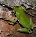
Green Tree Frogby biggood53Comment by graphicfunk: returning for comment
Colors here trump all. very nice with that natural wer look. Great capture. I voted you an 8 half hour back. |
| 10/09/2004 04:45:15 PM |
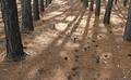
Lines,Shadows & Needlesby biggood53Comment by DarkRider: Hi Bruce,
Scott here from the Critique Club.
I really like the lighting in this pic from looking through your past challenge entries I see this is one of your better exposed pics. Your early challenge entries look like they suffered from poor exposure and I see some good improvements in your current photos. I do think that photo is lacking some composition. And didn't quite fit the challenge for complexity. I voted a 4 for this pic. For a photo that I feel didn't fit the challenge 4 is then purely based on how much the photo appeals to me. So please understand that I really found this pic interesting. I think you were in the right place at the right time for this one and if you could have played with you angle of composition it could have been a hit. As is your photo leaves me wanting more...it just doesn't fully satisfy me.
I do know that the Fuji website has some software updates posted. I know they did wonders for my Fuji 3800. the like is here.. Fuji Downloads
I also wanted to add that your "Snail on a rose", "Neon Reflections", and "Fire on Fraser Island" pics are some of my favorites from your profile.
If you have any questions or comments please feel free to PM me.
Scott.
After I posted your critique I found this link in the forum that might be useful for you.... CompositionMessage edited by author 2004-10-09 20:26:12. |
| Photographer found comment helpful. |
| 10/08/2004 10:42:00 AM |
A Bit of a Paneby biggood53Comment by Koriyama: The idea of using textured glass in a photo is very nice. However, I think you needed to prepare your final vision a bit better. In other words, the texture conflicts with the flower shapes rather than adds a painted feeling. As a suggestion, you could try moving the flowers further away from a less thick pane and focus on the flowers using a very limited dof. That should help reduce, yet retain some of, the negative impact of the glass. |
| 10/06/2004 07:46:10 PM |
A Bit of a Paneby biggood53Comment by Neil: I really like this but I think the composition could be stronger. The dark bar to the right should be cropped out, and I think much of the bottom with the green background as well. The contrast between the purple flowers and the frosted/distored glass works very well as an abstract (and of course would even be more appropos for part). Hope to see more versions of this later! |
| Photographer found comment helpful. |
| 10/06/2004 12:01:09 PM |
|
| Photographer found comment helpful. |
| 10/06/2004 05:22:11 AM |
|
| Photographer found comment helpful. |
Home -
Challenges -
Community -
League -
Photos -
Cameras -
Lenses -
Learn -
Help -
Terms of Use -
Privacy -
Top ^
DPChallenge, and website content and design, Copyright © 2001-2026 Challenging Technologies, LLC.
All digital photo copyrights belong to the photographers and may not be used without permission.
Current Server Time: 07/18/2026 09:07:48 AM EDT.