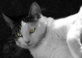
DPChallenge: A Digital Photography Contest You are not logged in. (log in or register
 
Browse Settings
Currently viewing:
Registered UserCantique

Show comments:

Per page:

Order:

Comments:


Comments Received by Cantique
Pages:   ... [75] [76] [77] [78] [79] [80] [81] ... [87]
Showing 771 - 780 of ~861
Image Comment
Extraordinary Bee
06/30/2004 09:14:39 PM
Extraordinary Bee
by Cantique

Comment by agrimace:
It is hard to get a good picture of a bee. I have been trying for a couple of days. This one is good.
Photographer found comment helpful.
Extraordinary Bee
06/30/2004 06:28:05 PM
Extraordinary Bee
by Cantique

Comment by airatic:
Looks like a plain 'ol bee to me. Too dark as well.
Photographer found comment helpful.
Extraordinary Bee
06/30/2004 05:03:11 PM
Extraordinary Bee
by Cantique

Comment by drgsoell:
Good macro. Lots of DOF. Good crop also.
Photographer found comment helpful.
Extraordinary Bee
06/30/2004 01:21:24 PM
Extraordinary Bee
by Cantique

Comment by Dr.Confuser:
Nice composition for the bee. Blends in a bit with the flower colors. Not you can do about where the bee lands. :)
Photographer found comment helpful.
Extraordinary Bee
06/30/2004 08:12:40 AM
Extraordinary Bee
by Cantique

Comment by notonline:
tighter crop to get rid of most of the blurry DOF would have had a bigger impact on my vote. it is an extroardinary shot but not a shot of extroardinary which is what the challenge is about. I still give it a <4> even tho I don't believe it fits the challenge
Photographer found comment helpful.
Eyes of the Cat
06/30/2004 02:56:07 AM
Eyes of the Cat
by Cantique

Comment by jadin:
Greetings from the Critque Club!

Composition:
Unfortunately desaturating all but the eyes was a fairly common submission for this theme. I think that adversely affected your score. Your actual framing of the cat is nicely done however. You did a good job with rule of thirds.

Lighting:
Having photographed cats many times, I think you did a good job. While some thought the left side was too bright, I think the cat itself is a rather 'bright' cat. And there is plenty of detail to make up for the bright area.

Technical:
You did nicely here. Very sharp in focus. Good exposure. I would like to see a division between the dark spots on the cat's head, and the background (carpet?). They seem to blend together, but that isn't something very controlable.

Post-processing:
I think this is where the photo needs the most work. Your desaturation is excellent, your contrast of the eyes is nice (not sure what the original looked like). But my complaint is the back of the neck and some of the back. At 1/350s it isn't motion blur, and at f/5.6 I don't _think_ it's depth of field. I believe it's some editing you did to it. either with clone brush, burn or dodge. It just _looks_ edited, and that bothers me. If it wasn't you, my apologies, but I think you'll understand where I'm coming from.

Overall:
I think you have a great capture here. You chose a pretty popular subject (eyes) which hurt your score. The only suggestion for improvement I have is the back of the neck, it appears overly edited. If it wasn't maybe a longer depth of field would help. Otherwise, there isn't much I'd change.

Hope you do better next time.
Photographer found comment helpful.
Eyes of the Cat
06/24/2004 08:42:45 PM
Eyes of the Cat
by Cantique

Comment by reddawk:
Eyes are scary... Photo quality is good...
Photographer found comment helpful.
Eyes of the Cat
06/23/2004 09:53:00 PM
Eyes of the Cat
by Cantique

Comment by photom:
The eyes are great - as is the entire left side of the image. But the bright white on the right side really takes over, not what you wanted.

Photographer found comment helpful.
Love Train
06/23/2004 08:52:42 PM
Love Train
by Cantique

Comment by graphicfunk:
from the Critique Club:
This is a very nice composition. You are introducing the universal ingredient of love into the static feel of the Train.
The facial expressions are convincing and the touching hands of the extended hands just adds charm. As is the composition is hard to improve upon.
The minor weakness is that while her head is on the plane of the camera, his head is at an angle and he is rewarded with a rim on his frontal cranium and the tip of his nose and a glint on bottom rim of his glasses. Of course, this could be done with reflectors and fill lights, but you did well in capturing the moment. A nice lesson to learn from this endeavor is to try to remember the intensity of the light and how well it all looks versus, the way the camera, with its limitations, captures the image. On this particular case you are asking the camera to render her in full light and him in shadow. It looks feasible to our eyes but the camera is never as sensitive. To an expert photoshop operator this is merely a simple case of selecting his face and adjusting levels a small amount. However, I would not worry about it because there is even the chance that this image will print better then out view on the screen.
I would also take the liberty to suggest cropping the top of the image down to the very start of the left red stripe. The train will still be discernable and the intimacy enhanced. Good shot, now go and outdo yourself. dan
Photographer found comment helpful.
Eyes of the Cat
06/23/2004 02:33:18 AM
Eyes of the Cat
by Cantique

Comment by C-town driver:
Beautiful clarity and focus. The darkened background works well to isolate the subject.
Photographer found comment helpful.
Pages:   ... [75] [76] [77] [78] [79] [80] [81] ... [87]
Showing 771 - 780 of ~861


Home - Challenges - Community - League - Photos - Cameras - Lenses - Learn - Help - Terms of Use - Privacy - Top ^
DPChallenge, and website content and design, Copyright © 2001-2025 Challenging Technologies, LLC.
All digital photo copyrights belong to the photographers and may not be used without permission.
Current Server Time: 06/16/2025 04:46:37 AM EDT.