| Image |
Comment |
| 06/24/2002 06:40:00 PM |
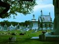
City of the Deadby arippsComment by jmsetzler: I really like the composition on this photo but I believe it's a bit underexposed. Based on the shadows in this photo, it appears that the sun is high in the sky and i'm wondering if this was toned down with software. It's hard to tell :) I think the photo is good but I would have rather seen a stronger interpretation of city life :) = 6 - jmsetzler |
| 06/24/2002 06:12:00 PM |
|
| 06/24/2002 03:55:00 PM |
|
| 06/24/2002 03:29:00 PM |
|
| 06/24/2002 01:40:00 PM |
|
| 06/24/2002 01:14:00 PM |
|
| 06/24/2002 12:32:00 PM |
|
| 06/24/2002 11:30:00 AM |
|
| 06/24/2002 08:51:00 AM |
City of the Deadby arippsComment by Kimbly: The color seems to be a bit blue on my monitor. I think compositionally it would have been better to try to focus on a few less of the tombs...but then you probably would have risked people not calling it 'city' enough. The tree makes a nice frame, but that black loop on the side is sort of distracting...can't tell if it's part of the tree or some sort of statuary. |
| 06/24/2002 12:37:00 AM |
City of the Deadby arippsComment by brumos: This image appears to have a very distinct cyan colour cast to it. Removing the colour cast and increasing the contrast would have improved the overall quality of this image. Also found this image to be a bit too busy. |
Home -
Challenges -
Community -
League -
Photos -
Cameras -
Lenses -
Learn -
Help -
Terms of Use -
Privacy -
Top ^
DPChallenge, and website content and design, Copyright © 2001-2026 Challenging Technologies, LLC.
All digital photo copyrights belong to the photographers and may not be used without permission.
Current Server Time: 07/16/2026 04:32:14 PM EDT.