| Image |
Comment |
| 05/04/2005 11:40:46 PM |
Thrustby aznymComment by ZSANNA: I gave you 10. It was my favorite pictures.
I can feel the movement and the B and W makes that stonger. |
 Photographer found comment helpful. Photographer found comment helpful. |
| 05/01/2005 10:41:14 PM |
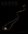
MAMBAby aznymComment by kearock: Text is very dark...difficult to read. Good composition though. |
| Photographer found comment helpful. |
| 05/01/2005 08:06:44 PM |
MAMBAby aznymComment by wetland: Very professional look. May be a little too dim on the letters but great angle. |
| Photographer found comment helpful. |
| 05/01/2005 11:23:18 AM |
MAMBAby aznymComment by w24x192: Astounding depth of field with great color. The layout to match the curves of a snake is just subtle enough not to be overpowering but without going unnoticed. This looks consumately professional. Have fun winning the challenge! |
| Photographer found comment helpful. |
| 05/01/2005 04:20:52 AM |
MAMBAby aznymComment by Artan: Clever idea, I would have prefered slightly greater depth of field to show more of the Neclace, however I appreciate this has been deliberatly chosen my you, for the affect. |
| Photographer found comment helpful. |
| 05/01/2005 01:22:01 AM |
|
| Photographer found comment helpful. |
| 04/30/2005 11:24:36 PM |
MAMBAby aznymComment by GeneralE: Type is a little too subtle on my monitor -- I'd have made it a bit brighter. |
| Photographer found comment helpful. |
| 04/30/2005 08:59:43 PM |
|
| Photographer found comment helpful. |
| 04/30/2005 12:48:40 PM |
MAMBAby aznymComment by banmorn: I like this a bit. the composition is very good and your use of focus with the necklace going from focus to extreme blur is a very nice touch. Like the colos as well. The jewels and setting a just a bit dark and lose some detail.
edit: changed blue to blur....yeesh. Message edited by author 2005-05-02 08:09:40. |
| Photographer found comment helpful. |
| 04/29/2005 11:21:13 PM |
MAMBAby aznymComment by LadeeM: Nearly perfect ... if only those jewels were shining! :) |
| Photographer found comment helpful. |
Home -
Challenges -
Community -
League -
Photos -
Cameras -
Lenses -
Learn -
Help -
Terms of Use -
Privacy -
Top ^
DPChallenge, and website content and design, Copyright © 2001-2026 Challenging Technologies, LLC.
All digital photo copyrights belong to the photographers and may not be used without permission.
Current Server Time: 07/23/2026 12:56:13 AM EDT.