| Image |
Comment |
| 05/31/2004 04:36:17 PM |
|
 Photographer found comment helpful. Photographer found comment helpful. |
| 05/31/2004 11:15:40 AM |
|
| Photographer found comment helpful. |
| 05/31/2004 10:01:03 AM |
|
| Photographer found comment helpful. |
| 05/31/2004 12:45:23 AM |
|
| Photographer found comment helpful. |
| 05/29/2004 08:03:48 PM |
|
| Photographer found comment helpful. |
| 05/29/2004 03:31:07 AM |
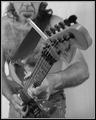
I really need to quit.by awpollardComment by tolovemoon: This is a good picture! The classic musicians ashtray!
I wished I had a seen it to vote on it there were so many to vote on....I would of gave ya 10!
|
| Photographer found comment helpful. |
| 05/28/2004 06:06:43 AM |
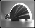
Dark side of the sconce(s).by awpollardComment by redmoon: now this is clever. i like this very much - the way you've warped the impression of scale is particularly impressive - these look for all the world like two modern life-size slightly sci-fi buildings (i know they're wall-mounted luminaires). monochrome works well, and the whole illusion is striking. even the far wall looks like sky. this should at least be top ten, if not a ribbon contender. easy 10. |
| Photographer found comment helpful. |
| 05/27/2004 02:15:20 PM |
Dark side of the sconce(s).by awpollardComment by photom: Definitely not somewhere you'd look every day. Nice job of exposure - crisp white, deep blacks and good tonal range in between. Subject is very interesting - the reflections from the point radiating out to the edge adds a lot of interest. Not at all thrilled with your cutsey border. |
| Photographer found comment helpful. |
| 05/26/2004 08:44:14 PM |
|
| Photographer found comment helpful. |
| 05/25/2004 04:29:56 PM |
|
| Photographer found comment helpful. |
Home -
Challenges -
Community -
League -
Photos -
Cameras -
Lenses -
Learn -
Help -
Terms of Use -
Privacy -
Top ^
DPChallenge, and website content and design, Copyright © 2001-2026 Challenging Technologies, LLC.
All digital photo copyrights belong to the photographers and may not be used without permission.
Current Server Time: 07/17/2026 02:11:20 AM EDT.