| Image |
Comment |
| 11/14/2004 01:44:08 AM |
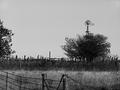
Augustby Prime_TimeComment by GeneralE: I like the composition and contrasting textures. The coloring makes it look kind of cold (though dry); where I live August is supposed to be hot. I wonder how this would look duotoned with a warm/hot color.... |
 Photographer found comment helpful. Photographer found comment helpful. |
| 11/13/2004 07:36:24 PM |
Augustby Prime_TimeComment by mrorange002: looks as if this was sharpened too much. tone it down a little, maybe cropp some of the sky and that tree on the left some. also the BW appears a bit "flat" good subject though. |
| Photographer found comment helpful. |
| 11/13/2004 01:09:00 AM |
Augustby Prime_TimeComment by Artyste: This photograph, to me, is far too "cool toned" for it's connection to "August". Looking at it, I feel a chill, and I had thought of a month like October, or March.. before August (I didn't see the title first, which is why I'm commenting).
A warmer tone, perhaps a duotone in the sepia/golden range, and you would have had a much higher score from me. |
| Photographer found comment helpful. |
| 11/12/2004 10:36:20 PM |
Eye Eyeby Prime_TimeComment by feauxteaux: I really like the idea behind this photograph - showing the eye of a needle with the person's eye behind it and showing through. I wish the top of the needle was fully in the field of focus - thats my only negative to the photograph. |
| Photographer found comment helpful. |
| 11/12/2004 09:48:00 PM |
Augustby Prime_TimeComment by L2: I liked the way you used the fence as a foreground element. Another option for composition might have been to change the angle a bit to separate the windmill from the tree, and eliminate the tall pole that is currently just left of center. Black and white was a good choice. |
| Photographer found comment helpful. |
| 11/12/2004 07:46:44 PM |
Augustby Prime_TimeComment by Kylie: I think the image would be near perfect except two nit-piks: the constrast is just one tad too much in my opinion, making it appear over-sharpened, and the windmill looks like it is growing out of the tree. |
| Photographer found comment helpful. |
| 11/12/2004 01:58:02 PM |
|
| Photographer found comment helpful. |
| 11/12/2004 01:29:45 PM |
Augustby Prime_TimeComment by Blackdog: Let me start with the score, get it out of the way, a six from me. Now as to why, I like this kind of image and have tried to make them myself. The graininess and poster like edges give it an interest thats hard to define. I feel that the cropping is a bit out, I think less sky and more of the interesting looking foreground fence would be better. Also changing position so that the windmill is not hidden behine the tree cound have given interest in the distance. Well done though, a good shot. |
| Photographer found comment helpful. |
| 11/10/2004 08:17:15 PM |
|
| Photographer found comment helpful. |
| 11/10/2004 04:48:19 PM |
|
| Photographer found comment helpful. |
Home -
Challenges -
Community -
League -
Photos -
Cameras -
Lenses -
Learn -
Help -
Terms of Use -
Privacy -
Top ^
DPChallenge, and website content and design, Copyright © 2001-2026 Challenging Technologies, LLC.
All digital photo copyrights belong to the photographers and may not be used without permission.
Current Server Time: 07/17/2026 05:54:24 PM EDT.