| Image |
Comment |
| 08/24/2004 05:07:02 PM |
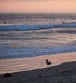
Beach Walkby KylieComment by Ecce_Signum: Did you do much post processing on this Kylie? I really like the light and dirrering colours on the waves and the seagull surveying all that is his. It just needed one of the surfers to be, well, surfing :) |
 Photographer found comment helpful. Photographer found comment helpful. |
| 08/24/2004 05:04:04 PM |
At Lastby KylieComment by Ecce_Signum: Now, if I could speil 'je ne se qua' thats what this shot says :) Oh, and thanks JPR, I thought they were ships on the horizon! |
| Photographer found comment helpful. |
| 08/24/2004 03:32:42 PM |
Searchingby KylieComment by mirdonamy: another amazing photo. The crop is a tiny bit tight on the right side. Let a tiny bit more of the beach show if possible (or next time). The capture of the birds is great. The colors are very soothing and beautiful. Great job! |
| Photographer found comment helpful. |
| 08/24/2004 03:30:56 PM |
Last Callby KylieComment by mirdonamy: Perfect photo of sunset. The crop, sunset, color and lighting is just perfect! Great job! |
| Photographer found comment helpful. |
| 08/24/2004 03:30:09 PM |
Slide Showby KylieComment by mirdonamy: Really great photo! Great colors, great angles... If possible, can you open the crop ont he bottom to include the bottom corner of the 4th window? If not, maybe cut it out a bit more to be more like the window diagonal to it (about 2/3 of a window showing). Also, take your clone/stamp tool in photoshop and get the tiny point sticking into the dark area from the light on the left 1/3 from the bottom... try to make that go away so it's not pulling any eyes toward it. it's very small, but still noticable.
I love this photo. It a great abstract!!! |
| Photographer found comment helpful. |
| 08/24/2004 03:26:30 PM |
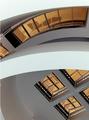
2050by KylieComment by mirdonamy: The geometry of the buildings is interesting, but this shot is stretching the focus a bit from white to black to orange to shadow to windows to bridges... it's all over the place. I also see some smudge near the top of the black/brown building on the left 1/3rd of the roof. The bottom middle where the bright white light shines through is a bit too bright actually. I like the shadow though. I am not totally fond of this shot, though I like some of the ideas... |
| Photographer found comment helpful. |
| 08/24/2004 03:24:14 PM |
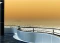
LAby KylieComment by mirdonamy: Beautiful colors. I love the feel. I would try a few things though... stamp over or color over the mountain top in the left 1/3 area to make it go away. It's distracting a bit. Also, consider a crop where the wall comes to the exact corner of the photo in the bottom left, either the top or bottom of that wall.
great job! |
| Photographer found comment helpful. |
| 08/24/2004 03:22:38 PM |
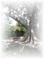
Retreatby KylieComment by mirdonamy: The tree is beautiful, but there is way too much white cloud around it i think. Too get this same feel without so much cloud on the outside, just take it into photoshop and lower the opacity to about 65 or 70% then flatten the image. It may give you teh same feel. You could also put a poem over it and sell it on DPCprints! Nice composition! |
| Photographer found comment helpful. |
| 08/24/2004 03:21:06 PM |
Water Mosaicby KylieComment by mirdonamy: This is a beautiful shot, worthy of framing if you have this type of decor in your home. I like the colors a lot, and the contrast is really nice. I think the diagonal line is a tiny bit distracting, but it also adds some brownish orange into the photo... so i am mixed on that. the white is a bit bright at the upper right, but it's not damaging to the photo overall. Nice job! |
| Photographer found comment helpful. |
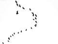
| 08/24/2004 03:19:28 PM |
Bell Curveby KylieComment by mirdonamy: Great capture. The photo is a bit stark (black/white) but that does add a nice feel. It's an interesting photo, that would work best in a set of photos for a particular subject (either the city you were in, or birds, or black/white). I picture it in a series at a museum, but not alone on a wall of a house. Very clean photo. Good job! |
| Photographer found comment helpful. |
Home -
Challenges -
Community -
League -
Photos -
Cameras -
Lenses -
Learn -
Help -
Terms of Use -
Privacy -
Top ^
DPChallenge, and website content and design, Copyright © 2001-2026 Challenging Technologies, LLC.
All digital photo copyrights belong to the photographers and may not be used without permission.
Current Server Time: 07/16/2026 04:55:38 PM EDT.