DPChallenge: A Digital Photography Contest You are not logged in. (log in or register
 
Browse Settings
Currently viewing:
Registered Userdebitipton

Show comments:

Per page:

Order:

Comments:


Comments Received by debitipton
Pages:   ... [75] [76] [77] [78] [79] [80] [81] ... [187]
Showing 771 - 780 of ~1863
Image Comment
JA Assignment1.jpg
08/07/2005 03:23:38 AM
JA Assignment1.jpg
by debitipton

Comment by Artyste:
Hi debitipton :)

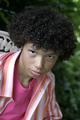
First of all, I just want to say that your lighting is fantastic. The shadows around the eyes that you are concerned about can probably be fixed with a simple reflector (piece of white foam board or something of the sort). In this situation, the best idea would be to tripod mount, and then use a cable-release, remote, or self-timer so you can free up a hand or two to reflect the light where you'd like it. A good fill flash might also work, but that would take more work, and a decent flash.. and if you don't have one, the foam board is far cheaper :) Other than that, wow.. you've really nailed the lighting. Fantastic.

Second, Composition. This is where you differ from the chosen shot, and I'll explain why. First, the rule of thirds. In your daughter's chosen shot, you'll notice that the photographer has used the rule of thirds in order to get a more dynamic, full torso, portrait orientated shot. This gives much more room to play with, and allows the model more freedom of movement, and creates less of a "cramped" feel. This is often a personal choice thing, but as we're emulating here, I thought I'd bring it up. In your shot, you've got the model's face dead center, instead of in the upper third of the composition. This tends to "deaden" the composition some, and creates cramping, as you lose space for body language and dynamic feel. You can see in the Jinky Art photo that the play of the torso and the hands gives us a little more story, where in your shot, she's suddenly cut off from us and seems to sink into the ground. Just something to stay aware of.

Finally, Color. First of all, I'll say that I like the desaturated look here a lot. I use it all the time, and it really works for this photograph. I think you made a good decision to deviate from the Jinky Art shot here, as one of the main reasons *I* see for the more saturated color look in that shot is to complement the color of the girl's hair. Your desat work really helps complement your model's skin tones and help her stand out. Good job on that, and it's just something I noticed. The other thing was that I'm wondering if maybe a slightly more saturated color in her skin tones would help as well.. I don't know what her tones are like IRL, but I feel that a little more red/yellow boost could be beneficial. Something to try anyway.

Great work here, try to mess around with your compositional elements a little more.. but you've got some great work.

Photographer found comment helpful.
Spencer assignment 2
07/26/2005 11:22:15 PM
Spencer assignment 2
by debitipton

Comment by debitipton:
Originally posted by Artyste:

Just one little note. Focus *seems* to have grabbed the front of his hair, leaving the eyes a little soft. This isn't a compositional thing, but it's such a common thing to happen, that you want to be ever watchful for it.


Yea -- I'm still trying to get the hang of this new 50mm lens. It's a lot more sensitive than I'm used to.
Spencer assignment 2
07/26/2005 11:18:30 PM
Spencer assignment 2
by debitipton

Comment by Artyste:
Excellent. Great dynamic composition, and you clearly know what you want and went about to get it. I agree that most of the compositional aspects I'd touch on would be fixed in post, as you say, so I'll leave those comments for after, if needed.

Just one little note. Focus *seems* to have grabbed the front of his hair, leaving the eyes a little soft. This isn't a compositional thing, but it's such a common thing to happen, that you want to be ever watchful for it.
Photographer found comment helpful.
Buck'in Bronco
07/26/2005 09:04:02 AM
Buck'in Bronco
by debitipton

Comment by Jutilda:
Wow this is great. I love the movement. Your choise of sepia is perfect considering the floor is dirt. Nice one!
Photographer found comment helpful.
Buck'in Bronco
07/26/2005 08:42:48 AM
Buck'in Bronco
by debitipton

Comment by SJCarter:
Great action shot. I almost wish I could make out the cowboys a little more, but I've never been a real big fan of a lot of motion blur. You seem to pull it off though - the horse is in focus enough to really make you want to examine the shot more closely. I think the antique effect also works well. Good shot.
Photographer found comment helpful.
Sophie in black
07/24/2005 10:58:49 PM
Sophie in black
by debitipton

Comment by SJCarter:
I'm not a cat fan... However, this is a really cool shot. Love the darkness of the subject and background (difficult to tell where one ends and one begins), because it really leaves the focus on the eyes. I think I'd like to see the image a little sharper (although you probably made an artistic choice to make it a softer focus). Very cool shot - excellent composition.

Message edited by author 2005-07-24 22:59:07.
Photographer found comment helpful.
Inside - Out
07/24/2005 11:37:54 AM
Inside - Out
by debitipton

Comment by Jutilda:
I just ran across this in the "Vintage" gallery. I like the focus alot. The detail of the window and surround wood is nicely done. I love old buildings - they almost tell a story don't they? Great use of lighting and the angle including the other window is GREAT! Good one.
Photographer found comment helpful.
Wagon Wheel
07/19/2005 09:42:57 PM
Wagon Wheel
by debitipton

Comment by Jutilda:
Nice detail. Maybe desaturate the red a touch and it'd be really great!
Trinity
07/18/2005 05:37:44 PM
Trinity
by debitipton

Comment by debitipton:
Originally posted by kpriest:

This must be a granddaughter? Congrats on 8th place!


Not my granddaughter but a friends granddaughter. (whew!) My 20 something kids aren't ready for that step yet... or as Amanda will tell you -- EVER!
Trinity
07/18/2005 11:38:01 AM
Trinity
by debitipton

Comment by twm122:
Congrats on your top ten finish. I still love this one alot.
Photographer found comment helpful.
Pages:   ... [75] [76] [77] [78] [79] [80] [81] ... [187]
Showing 771 - 780 of ~1863


Home - Challenges - Community - League - Photos - Cameras - Lenses - Learn - Help - Terms of Use - Privacy - Top ^
DPChallenge, and website content and design, Copyright © 2001-2025 Challenging Technologies, LLC.
All digital photo copyrights belong to the photographers and may not be used without permission.
Current Server Time: 07/31/2025 07:53:12 AM EDT.