| Image |
Comment |
| 08/19/2002 10:18:00 AM |
|
| 08/19/2002 10:01:00 AM |
|
| 08/19/2002 06:14:00 AM |
|
| 08/19/2002 01:31:00 AM |
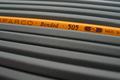
One of a Kindby bdshortComment by cq107: I was about to DQ for layers, but I see now that they are all burned... nice job, "DOF" and lighting well done... 9 |
| 08/10/2002 01:23:00 PM |
|
| 08/09/2002 02:31:00 PM |
|
| 08/09/2002 10:34:00 AM |
|
| 08/08/2002 10:48:00 AM |
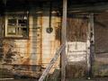
This Old Houseby bdshortComment by owennnn: not an interesting angle (head on), but contains many old elements - flaking paint, broken windows, midding doorknob, askew boards. |
| 08/06/2002 12:35:00 PM |
|
| 08/06/2002 11:06:00 AM |
This Old Houseby bdshortComment by courtenay27: I like the aged look of the house but for me there is no clear focal point. My eyes shift between the broken window and the boarded up door. To further complicate things the horizontal elements of the electricity meter (?) and the wooden supports lie right in the middle of the frame adding more separation to the two possible subjects. Focusing on one element (door or window) and maybe composing the supports off to one side would have worked better for me. This would probably look good in B&W too. |
Home -
Challenges -
Community -
League -
Photos -
Cameras -
Lenses -
Learn -
Help -
Terms of Use -
Privacy -
Top ^
DPChallenge, and website content and design, Copyright © 2001-2026 Challenging Technologies, LLC.
All digital photo copyrights belong to the photographers and may not be used without permission.
Current Server Time: 07/26/2026 11:33:12 PM EDT.