| Image |
Comment |
| 05/14/2004 04:19:32 PM |
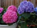
Girl & Boy Hydrangeaby JudeComment by sadrzy: Flower hues are nice, but do not contrast (e.g., red vs. green or blue vs. orange). Blue petals seems out of focus. Greens are very dark, perhaps too dark, and could have contrasted well with the reddish bunch of flowers. |
| 05/14/2004 01:36:39 PM |
Girl & Boy Hydrangeaby JudeComment by Pixelprose: a bit out of focus, would have played with the depth of field to blur out the background to make the flowers stand out more |
| 05/14/2004 12:39:56 PM |
Girl & Boy Hydrangeaby JudeComment by cghubbell: Ouch. Gotta get rid of the time/date stamp. too many distraction in this image as well. The pots, the fence, the shadows. the colors could be a bit more saturated also. |
| 05/13/2004 03:50:12 PM |
Girl & Boy Hydrangeaby JudeComment by Tallbloke: Not really opposite in colour, shape, type or composition. In fact the only thing you've done opposite is leave the date on your picture which is the opposite of what most people would do. (2) coz at least its in focus. |
| 05/13/2004 02:43:43 PM |
|
| 05/13/2004 01:05:47 PM |
|
| 05/13/2004 03:48:25 AM |
|
| 05/13/2004 01:15:46 AM |
Girl & Boy Hydrangeaby JudeComment by CDS: The focus seems a little 'soft'. The background detracts from the overall feeling of the picture. |
| 05/13/2004 12:54:12 AM |
|
| 05/13/2004 12:02:28 AM |
Girl & Boy Hydrangeaby JudeComment by trying2bstill: I don't find this interesting. Not enough of the flowers. Maybe coming in closer and filling the frame with the flowers would help. Oh yeah, and turning off the date stamp. 4 |
Home -
Challenges -
Community -
League -
Photos -
Cameras -
Lenses -
Learn -
Help -
Terms of Use -
Privacy -
Top ^
DPChallenge, and website content and design, Copyright © 2001-2026 Challenging Technologies, LLC.
All digital photo copyrights belong to the photographers and may not be used without permission.
Current Server Time: 07/16/2026 05:56:40 AM EDT.