| Image |
Comment |
| 06/03/2004 10:52:22 PM |
Pale Josephine Reduxby JesuispeureComment by magnus: Definitely better! Still very creative, but much more accessable. I particularly like how the photo is centered on her navel, which is one of the less blurred parts, and then the burst of light in the background gives even more feel of motion. |
 Photographer found comment helpful. Photographer found comment helpful. |
| 06/02/2004 11:19:31 PM |
Pale Josephine Reduxby JesuispeureComment by Glen King: I definitely like this much better. The bracelet is a bit of a distraction and may not be needed. I like the way the necklace adds to the overall motion effect. Great Shot, I'd give this one a 10. |
| Photographer found comment helpful. |
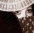
| 06/02/2004 10:29:52 PM |
Peek-A-Boo...by JesuispeureComment by scalvert: Yes, there are 3 fans, but the subject here are those great eyes. Perhaps with a little more light on the dark fan and a wider crop you might get a little more attention on the fans. Wish I could see the color version- it looks like you had a good exposure on the eyes. |
| Photographer found comment helpful. |
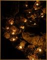
| 06/02/2004 09:53:06 PM |
River of Lightby JesuispeureComment by soccerdad: I liked the photo, ranked it a 6. I like your Photographer's comments even better. Priceless insights that remind us this is a hobby and should be fun. |
| Photographer found comment helpful. |
| 06/02/2004 09:01:41 PM |
|
| Photographer found comment helpful. |
| 06/02/2004 07:14:43 PM |
Peek-A-Boo...by JesuispeureComment by nicoledb: Very nice! The only thing I find slightly distracting is that the right eye is almost touched by the upper fan, looks a bit unnatural. |
| Photographer found comment helpful. |
| 06/02/2004 07:04:16 PM |
Technicolorby JesuispeureComment by GeneralE: I plan to steal this idea (not for DPC though!) and probably with a different technique, although I may try to follow your's 'cause I've never tried it like that. Great idea, execution! |
| Photographer found comment helpful. |
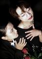
| 06/02/2004 02:16:45 PM |
Dragby JesuispeureComment by melismatica: I liked this photo quite a bit and if I had been using my current voting methods for this challenge (didn't know I could revise votes for one thing) I probably would have scored it higher than the 6 I gave it.
I caught the opposite right away. The title helps without nailing the viewer over the head (although judging by some of the comments, it seems some people need to be slapped in the face with an idea before they get it).
I like the slight over exposure on the faces. I think it heightens the slight skewing of reality for the viewer. The tilted format achieves this as well. I don't know if you intended this but that's how it works for me.
I like how their black clothes disappear into the background. The models are beautiful. |
| Photographer found comment helpful. |
| 06/02/2004 02:02:40 PM |
Technicolorby JesuispeureComment by melismatica: Here's one I missed. I really should have voted on all the Centered entries. I keep discovering new ones.
This is really FAB-ulous. It would be incredible blown up really large. Love the square format. Love the guady, glitzy rainbow colors. Why be too-too precious about a flower? Need I mention the great lighting and sharp focus?
Super! Sorry I missed voting on it.
Melissa |
| Photographer found comment helpful. |
| 06/02/2004 01:58:35 PM |
River of Lightby JesuispeureComment by melismatica: I liked this one better at first glance. I think it is a great idea but the cropping is a bit tight to get the real sense of flow. That may also be because of the vertical format. It seems a bit like it is falling out of the frame. It's a little too dark in the shadows.
Judging by your comments, I can't imagine you want to try again but it might be worth it. I gave this a five because the competition was so fierce in this challenge. I did a lot of careful viewing of photos for this challenge and revised a lot of votes. Initially, this got a 6 from me. I really liked the idea. I thought you had buried twinkle lights fairy lights so just the bulbs were showing. I didn't realize the lights were candles. Either way, I liked it. |
| Photographer found comment helpful. |
Home -
Challenges -
Community -
League -
Photos -
Cameras -
Lenses -
Learn -
Help -
Terms of Use -
Privacy -
Top ^
DPChallenge, and website content and design, Copyright © 2001-2026 Challenging Technologies, LLC.
All digital photo copyrights belong to the photographers and may not be used without permission.
Current Server Time: 07/16/2026 11:29:49 PM EDT.