| Image |
Comment |
| 11/30/2005 12:29:33 PM |
|
 Photographer found comment helpful. Photographer found comment helpful. |
| 11/24/2005 05:16:30 PM |
Once Upon A Time... by aerogurlComment by stormy: Great set up, the tones of the shot are nice and give a good effect and set the mood well. As you said earlier, you couldn't write with the quill, but it is still my suggestion for improvement. |
| Photographer found comment helpful. |
| 11/15/2005 07:57:28 PM |
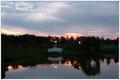
Reflectionsby aerogurlComment by Spicelynn: This would have been better if it was taken just before the lights came on, and the sun was completely down so there was better lighting. But still a nice picture! |
| Photographer found comment helpful. |
| 11/13/2005 10:03:52 AM |
|
| Photographer found comment helpful. |
| 11/11/2005 12:00:56 PM |
Reflectionsby aerogurlComment by chalice: I think I would have put the bridge a little to the side (rule of thirds). For some reason my eyes are 'fighting' the placement here. |
| Photographer found comment helpful. |
| 11/11/2005 10:49:34 AM |
Reflectionsby aerogurlComment by Lenny_D: Position bridge is too exactly in the middle. I don't think the rest of the picture is symmetric enough to do this. Nice reflections. |
| Photographer found comment helpful. |
| 11/10/2005 05:05:08 AM |
Reflectionsby aerogurlComment by Jammur: This is an uncomfortable image. IMO the tonal values are skewed, It would work better if the sky were darker and the central land areas were lighter/brighter showing more detail. Perhaps it something that could be done with shadow and midtone adjustments via curves |
| Photographer found comment helpful. |
| 11/07/2005 08:06:05 PM |
|
| Photographer found comment helpful. |
| 11/04/2005 07:20:14 PM |
|
| Photographer found comment helpful. |
| 11/02/2005 01:12:22 AM |
|
| Photographer found comment helpful. |
Home -
Challenges -
Community -
League -
Photos -
Cameras -
Lenses -
Learn -
Help -
Terms of Use -
Privacy -
Top ^
DPChallenge, and website content and design, Copyright © 2001-2026 Challenging Technologies, LLC.
All digital photo copyrights belong to the photographers and may not be used without permission.
Current Server Time: 07/22/2026 06:36:35 PM EDT.