| Image |
Comment |
| 04/17/2005 09:46:39 AM |
|
| 04/16/2005 10:10:54 PM |
|
| 04/14/2005 07:16:08 PM |
|
| 08/03/2004 02:10:06 PM |
|
| 08/02/2004 08:26:53 PM |
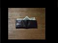
The Walletby Fairfield20Comment by Cam: Neat photo, and idea...I wish it was centered just a bit better, but looks good. Can I borrow 10 bucks :) |
| 08/02/2004 01:57:49 PM |
The Walletby Fairfield20Comment by Bassie: I have the same flooring and the same wallet. Hey wait a minute! Is that mine? It looks like mine. Oh, sorry, my mistake. I have Canadian money in my wallet. |
| 08/01/2004 11:31:28 AM |
|
| 07/30/2004 07:37:44 AM |
|
| 07/28/2004 07:47:03 PM |
|
| 07/28/2004 05:21:20 PM |
The Walletby Fairfield20Comment by Skip: nice idea, but the execution could use a little polishing. the lighting is a little too strong; while you want detail in the wallet, you want to avoid hotspots. the black is a little too strong; this could be fixed by cropping to just outside the table edge. lastly, as the wallet is the subject, you could stand to get a little closer to it. the key is to keep working with it. |
Home -
Challenges -
Community -
League -
Photos -
Cameras -
Lenses -
Learn -
Help -
Terms of Use -
Privacy -
Top ^
DPChallenge, and website content and design, Copyright © 2001-2026 Challenging Technologies, LLC.
All digital photo copyrights belong to the photographers and may not be used without permission.
Current Server Time: 07/15/2026 11:30:48 PM EDT.