| Image |
Comment |
| 01/27/2003 03:15:24 AM |
|
 Photographer found comment helpful. Photographer found comment helpful. |
| 01/26/2003 11:53:53 PM |
|
| 01/26/2003 08:48:16 PM |
One Wayby boyte1Comment by PTLParsons: This one gets it for humor. They just said "road sign" and sure didn't say where they had to be did they. Looks like it's beginning to peel away from your thumb on the back end of it. Just a little dark, but not enough to really hurt the photo that much. Shadows are a bit distracting, under the thumb and on the side of the first finger Nice B & W. Nice composition with decent execution. Congrats on a 7. |
| Photographer found comment helpful. |
| 01/26/2003 08:47:03 PM |
One Wayby boyte1Comment by jgillard: I think if the one way sign was pointing downwards it would be much funnier! ;) jgillard6 |
| 01/26/2003 04:30:02 PM |
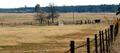
Casey Jones Ranchby boyte1Comment by Turbotech: Critique Club
Does your subject grab your attention? Yes
Sharpnes:Good
Is the sharpness important? Yes for this shot it is.
Exposure:I believe the exposure is done very well here.
Composition: I believe the compositon here works well. Of course the eyes will go to the brightest object in the photo so the white gate is a good addition to the shot. The fence on the right side veers my attention a little but the white of the Gate refocuses to the center of the shot. It is a landscape. These are difficult to do since not every landscape is breathtaking to say the least. You did well by limiting the sky in this shot. Under certain Rules of composition you want to eithier have a lot or a little Sky. For the landscape that it is, I think you did a good job with Depth and that is what is important about the Fence that runs down the right.
Overall I think this is a good technical shot with good intentions. It would take me a while to think about how I could do this shot better. My conclusion right now is that I can not.
TurboTech. |
| 01/26/2003 01:48:49 PM |
|
| Photographer found comment helpful. |
| 01/26/2003 01:40:35 PM |
|
| Photographer found comment helpful. |
| 01/25/2003 07:18:05 AM |
One Wayby boyte1Comment by Jacko: Cute composition. Would like to see more lighting on the sign, since it's supposed to be the main subject. Jacko. Good luck. I like it. 8 |
| Photographer found comment helpful. |
| 01/25/2003 06:16:36 AM |
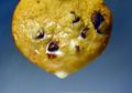
Dripping with Moo Juice!by boyte1Comment by bamaster: I like the simplicity of this. But the milk looks watered down... skim? I used whipping cream on my photo because it's much thicker and whiter than plain ol' milk. Now I'm hungry for a cookie. |
| Photographer found comment helpful. |
| 01/24/2003 07:57:15 PM |
One Wayby boyte1Comment by Bullwinkle: A cute pic! Good sense of humour and a nice creative touch. B&W works well for this shot. I like the close cropping, too. The knuckles are a tad bright compared to the other flesh tones for my taste. A good foto. |
| Photographer found comment helpful. |
Home -
Challenges -
Community -
League -
Photos -
Cameras -
Lenses -
Learn -
Help -
Terms of Use -
Privacy -
Top ^
DPChallenge, and website content and design, Copyright © 2001-2026 Challenging Technologies, LLC.
All digital photo copyrights belong to the photographers and may not be used without permission.
Current Server Time: 07/21/2026 06:22:23 PM EDT.