| Image |
Comment |
| 01/29/2003 02:04:12 PM |
|
 Photographer found comment helpful. Photographer found comment helpful. |
| 01/29/2003 05:19:56 AM |
One Wayby boyte1Comment by sulamk: Greetings from the Critique Club
Composition
A clever, and original idea! You could perhaps have aligned the sign so that it hid the Tip of your thumb. The black and white format was a very good choice for this image, it would not been as effective for me in colour.
Exposure and Lighting
The lighting is not quite right it is too bright on the top of your hand and too dark on the sign. This is giving a somewhat soft look to the image it needs a bit more contrast.
Suggestions for improvement
Different lighting
Perhaps having the back of the hand showing rather than the fingers!
Hard too improve a very good shot! |
| Photographer found comment helpful. |
| 01/29/2003 01:16:45 AM |
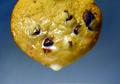
Dripping with Moo Juice!by boyte1Comment by indigo997: The reminds me of that (was it an orange slice?) photo w/ the juice dripping off. I like the bg gradient. I have to kind of agree that sometimes natural just doesn't look as "natural" as something fake. This milk does look really watery. I also have to agree about the lighting and reflections on it. Did you diffuse the lighting? The right side of the cookie looks rather dark compared to the left side. Even, diffuse lighting is one of my biggest challenges, but I think it could've helped here. I sort of like the simplicity of just the cookie on the bg, but it would also be interesting to see it half dipped in some milk - esp if you could get the cookie to reflect in the milk - sort of like a cookie sunset. Then you wouldn't have this wet cookie look (which isn't all that appealing to me). Good focus (*lol* I typed food focus first... freudian slip?). Quality shot that deserved to do better IMO. This is about taking good shots, and this just doesn't have enough room for improvement to be sub 5. Nice camera btw :P
*lol* I also find the title a bit obscene for some reason. Maybe it's just my mind. |
| 01/28/2003 07:12:17 PM |
|
| Photographer found comment helpful. |
| 01/28/2003 05:10:22 PM |
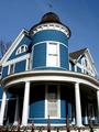
The Blue Houseby boyte1Comment by Alecia: very pretty coloring--you couldnt have asked for a better sky! the only thing i might have done differently was either cropped closer in to the center cloumns or wider to allow a little more room for the curves to be accented by the lines on either side. nice work! |
| 01/28/2003 12:30:29 PM |
|
| 01/28/2003 11:24:35 AM |
|
| Photographer found comment helpful. |
| 01/28/2003 01:53:36 AM |
|
| Photographer found comment helpful. |
| 01/27/2003 11:17:41 PM |
|
| Photographer found comment helpful. |
| 01/27/2003 09:29:16 PM |
|
Home -
Challenges -
Community -
League -
Photos -
Cameras -
Lenses -
Learn -
Help -
Terms of Use -
Privacy -
Top ^
DPChallenge, and website content and design, Copyright © 2001-2026 Challenging Technologies, LLC.
All digital photo copyrights belong to the photographers and may not be used without permission.
Current Server Time: 07/22/2026 11:04:47 PM EDT.