| Image |
Comment |
| 02/17/2003 05:17:44 AM |
|
 Photographer found comment helpful. Photographer found comment helpful. |
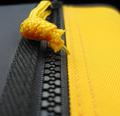
| 02/17/2003 01:57:53 AM |
Knot Yellowby boyte1Comment by ChrisW123: Even the knot is not pefectly in focus. Look like the DOF is too small and about 1/2 inch in FRONT of the knot! 6. :( |
| Photographer found comment helpful. |
| 02/17/2003 01:46:47 AM |
|
| Photographer found comment helpful. |
| 02/17/2003 01:22:55 AM |
Half Mastby boyte1Comment by Sonifo: I can't believe you took 38th. What a rip off!!!! This is an excellent photo. You must be so frustrated. You got a 10 from me on this one. Keep shooting!! |
| Photographer found comment helpful. |
| 02/17/2003 01:08:26 AM |
Organized Chaosby boyte1Comment by tomzinho: if the sky were blue in the background, i would give you an 11. so instead, i guess i had to give you just a 10. this is so what i wish i could have done for this competition. chaos but ordered . . . very well done. |
| Photographer found comment helpful. |
| 02/17/2003 12:42:56 AM |
|
| Photographer found comment helpful. |
| 02/16/2003 06:14:16 PM |
Blonde and Blue????by boyte1Comment by Alecia: CC
what a great shot! the contrasts and conposition really draw me into this picture. i love the choice of background--it really enhances the blackish blue hair--which in turn is enhanced by the choice of shirt color. i remember during voting i kept looking at this shot, trying to imagine if i would like the photograph better up over her nose so you could just see her eyes (for a more dramatic effect), but cant really decide. either way would work i am sure! another contrasting aspect i like is the fact that the blonde picture has so much color, the greens, reds and yellows, as compared to the main shot, which really, for some reason draws attention to her eyes---which is where all the emotion is.
technically, i like what you have done--i like the extra lighting on the right--it and the spiky hair add much depth to the bacground of the shot, which helps balance out the depth the smaller picture creates in the front.
all in all, very nice work! Message edited by author 2003-02-16 18:14:58. |
| 02/15/2003 10:09:23 PM |
|
| Photographer found comment helpful. |
| 02/15/2003 04:04:13 PM |
Cliche' Sunflower Shot # 73by boyte1Comment by timj351: Critique Club critique from timj351
You certainly picked a gorgeous flower for this shoot. I don't mind the angle at all. What I don't really like is the background. I think this is because it doesn't appear very natural to me. It serves to only provide a smooth background but it doesn't seem to compliment or support the flower in a visual way. Sometimes what works very well is to use the same colors that are in the main subject as a background. In this case I can image a very light yellow or even green cloth or fabric. This isn't the type of photo that requires a complimentary color for contrast, but rather a similar color, to create a color theme that provides a soft, inviting feel to the scene.
Your use of focus is perfect here. There is sharp, edgy detail in the leaves where it is appropriate and softer detail in the petals where it accentuates the color and smooth lines.
Your use of lighting is good, particularily in the way the shadows are nice and soft matching the flower nicely.
The composition works well enough and I don't have any problems with the downward angle of the flower. I might have tried to emphasise the beautiful shapes of the petal and leaves some more by trying some different compositions and framing it even closer but that's just me and not right or wrong. As it is, it is a nice composition that doesn't detract from the beauty of this flower.
The colors are very natural looking and it is presented very cleanly. I feel you did a nice job with this photo.
Tim Jensen
|
| 02/15/2003 10:53:12 AM |
|
| Photographer found comment helpful. |
Home -
Challenges -
Community -
League -
Photos -
Cameras -
Lenses -
Learn -
Help -
Terms of Use -
Privacy -
Top ^
DPChallenge, and website content and design, Copyright © 2001-2026 Challenging Technologies, LLC.
All digital photo copyrights belong to the photographers and may not be used without permission.
Current Server Time: 07/23/2026 04:11:26 PM EDT.