| Image |
Comment |
| 07/11/2003 05:00:43 AM |
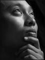
almost androgynousby grigrigirlComment by p_johns: I think that you may have gone too far with your lighting of this picture - your blacks are too black where you lose any definition adn the whites are blown out - ie on the butt. However it is a nicely contrasted picture which offsets off the background. The pose is really good. |
 Photographer found comment helpful. Photographer found comment helpful. |
| 07/11/2003 03:46:24 AM |
almost androgynousby grigrigirlComment by SharQ: Seems blurry and I am not too sure about the lack of light in his face. The pose also seems very unnatural, and a black border around a black picture seems to make very little sense. Cool title and good model, though. Perhaps the image would have more impact if he looked straight into the camera lens. |
| Photographer found comment helpful. |
| 07/11/2003 01:57:47 AM |
|
| Photographer found comment helpful. |
| 07/11/2003 01:29:52 AM |
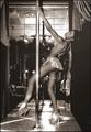
boys night outby grigrigirlComment by Fayech: The sepia treatment really takes away from this image. It looks more like an old photo. Color would have added some energy to this. |
| Photographer found comment helpful. |
| 07/11/2003 12:34:21 AM |
almost androgynousby grigrigirlComment by Pedro: the lighting is a little off, and the pose looks quite un-natural (maybe that's what you were going for). I think you either shadow the face or don't - just the arm shadow messes the perspective up a bit.
**edit: still not even close to the best you've done of this subject (no offense intended). Now that I know it's yours I'm taking more time with it, and I still don't like the way that shadow draws a line on his face. The focus is a little soft...intentional to hide some skin imperfections? If I didn't know it was you, I would think some of these things were accidents...but I know your work better than that. As it happens I just don't agree with some of the choices.
P Message edited by author 2003-07-21 21:44:54. |
| Photographer found comment helpful. |
| 07/11/2003 12:10:59 AM |
|
| Photographer found comment helpful. |
| 07/10/2003 08:37:12 PM |
human landscape.jpgby grigrigirlComment by Journey: This is a part of the human body that i indeed find very beautiful and i fully agree with your title. What *i* don't like so much is that the picture seems underexposed (or something else ?) and it creates blurriness. I suspect that this is deliberate on your part and hence i cannot really judge this until i know your motivations.
I do like the border but i don't like it here. I find it distracting and interfering with the actual landscape. Would have preferred either no border or a black border (same black tone as is in the background).
YMMV on all i have said above.
I sense that you have a real knack for nude photography and can only encourage you to keep on exploring this until you find your own language there. Please keep this in mind when i comment on your other nude pictures, okay? If any strong disagreement with my comments, feel free to contact me.
BTW, i find your profile picture one of the coolest i have seen on dpc and wish i could see it in a larger edition. |
| Photographer found comment helpful. |
| 07/09/2003 11:23:57 PM |
|
| Photographer found comment helpful. |
| 07/09/2003 10:28:44 AM |
|
| Photographer found comment helpful. |
| 07/09/2003 09:23:42 AM |
boys night outby grigrigirlComment by Shiiizzzam: Awesome photo with great tone. I want her shoes :) Title is perfect. She seems to be in her own little world and not posed. GREAT photo and meets the challenge well. |
| Photographer found comment helpful. |
Home -
Challenges -
Community -
League -
Photos -
Cameras -
Lenses -
Learn -
Help -
Terms of Use -
Privacy -
Top ^
DPChallenge, and website content and design, Copyright © 2001-2026 Challenging Technologies, LLC.
All digital photo copyrights belong to the photographers and may not be used without permission.
Current Server Time: 06/21/2026 01:30:52 PM EDT.