| Image |
Comment |
| 05/05/2004 09:54:46 AM |
|
 Photographer found comment helpful. Photographer found comment helpful. |
| 05/05/2004 06:57:25 AM |
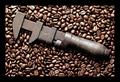
Rust never sleeps. (now we know why)by BradComment by cghubbell: So maybe I'm biased because I'm a tool freak, but I really am impressed that you thought of (what seems to be) coffee beans as a background. They create a perfect contrast! This kind of image is exactly why I joined DPC - thank you! |
| Photographer found comment helpful. |
| 05/05/2004 02:57:27 AM |
|
| Photographer found comment helpful. |
| 05/05/2004 01:29:46 AM |
|
| Photographer found comment helpful. |
| 05/05/2004 01:03:51 AM |
|
| 05/04/2004 10:45:56 AM |
|
| Photographer found comment helpful. |
| 05/04/2004 07:16:36 AM |
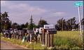
The Elements of Subject & Hopeby BradComment by jpochard: Hello from the Critique Club!
Who hasn't hoped to get something good in the mail? I think this is a great shot for the challenge.
Technically, My first impression is that it's very good....clear focus and nice depth to the colors. I'm assuming you probably tried different angles. I would like to see how a more "straight on" angle to the mailboxes, looking up to include the street sign might have worked. With this one, the sign just seems a bit far away from your main subject - the boxes. I would have fooled around with the angles to try to get an illusion of the sign being closer.
Good job!
I hope this has been helpful. |
| Photographer found comment helpful. |
| 05/03/2004 08:57:48 AM |
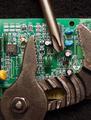
Bigger isn't always better....by BradComment by Neuferland: I like the way this shot really comes off the screen to me and the lack of proportion of the tools to the computer board is very well done. A tighter crop on the top and bottom to take out the black space would really emphasize the lack of proportion to me though and a touch more sharpness. An 8 |
| Photographer found comment helpful. |
| 05/02/2004 07:52:34 PM |
|
| Photographer found comment helpful. |
| 04/30/2004 10:00:06 AM |
|
| Photographer found comment helpful. |
Home -
Challenges -
Community -
League -
Photos -
Cameras -
Lenses -
Learn -
Help -
Terms of Use -
Privacy -
Top ^
DPChallenge, and website content and design, Copyright © 2001-2026 Challenging Technologies, LLC.
All digital photo copyrights belong to the photographers and may not be used without permission.
Current Server Time: 07/17/2026 11:20:47 AM EDT.