Aging Gracefullyby
MobiusComment by photom: Hi William and *Greetings from the Critique Club *
Your second challenge - congratulations!
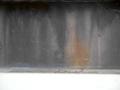
As an abstract - rules about focus are "thrown out" so we need to concentrate on textures, lines, shapes and colors. Composition - the placement of items within the image - become critical, as the viewers can't relate to something recognizable.
Your image has one area of the golden yellow color which you place about 1/3 of the distance from the left - PERFECT! The wonderful shapes along the top of the frame are also very nicely done.
On the other hand, when your picture was loading - I thought there was something wrong with my browser when the bottom of the image loaded. As other comenters have noted, the large white area does attract too much attention. It is so stark it really competes with the nice subtle colors and textures in the main image. I do like the thin gray band just above the white - if the entire bottom were similar, you'd have a much stronger image.
Another less significant problem is the straight diagonal line that slopes down from the middle left to the right edge. This line doesn't seem to "fit" well into your abstract patterns.
To me the image looks like a water fountain in a city pond with several sprays of water jetting up from the base.
Nice job - and keep submitting!