| Image |
Comment |
| 07/18/2006 06:38:25 PM |
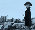
Centuries Apartby FirstyComment by tate: this is funny to me simply because it looks like something I would do :) ... I like the idea a great deal. I think it needs something - like more of a view of the face. I'm not really a big fan of the color just because it has eliminated white and that high tonal range. I would suggest using a desaturation effect with on an RGB image and use "colorize" which will give you a more complete tonal range. Hopefully this makes sense and hopefully you use photoshop because that's what I'm talking about. I did locate a movie link to illustrate a good way to do this:
//www.photoshopsupport.com/tutorials/tt/adjustment-layer-mov.html |
 Photographer found comment helpful. Photographer found comment helpful. |
| 07/18/2006 04:29:49 PM |
Centuries Apartby FirstyComment by Tygerr: Brilliant set-up. Very strong composition. I'd like to see the colour version - I wonder if the blue hue is a bit unnecassary. Still, one of my favourites of the challenge. And a clever pun in the title. |
| Photographer found comment helpful. |
| 07/18/2006 12:20:34 PM |
|
| Photographer found comment helpful. |
| 07/18/2006 11:20:35 AM |
|
| Photographer found comment helpful. |
| 07/18/2006 10:51:04 AM |
Centuries Apartby FirstyComment by LalliSig: Not really fond of the blue duotone here, I think I would have liked this shot better in just plain b/w or in low sat, strong contrast color. Nice idea though and well executed. |
| Photographer found comment helpful. |
| 07/18/2006 10:32:07 AM |
Centuries Apartby FirstyComment by UrfaK: the first pic of the challenge that made me sit up. A very good shot and if you have time you should setup very mild sun rise colours at the horizon between the rocks and the buildings. Not only will that put a healthy balance of colours but also add to to the whole progress thing since sunrises represent new beginnings and stuff. A very cool shot. |
| Photographer found comment helpful. |
| 07/18/2006 04:10:15 AM |
Centuries Apartby FirstyComment by roba: very interesting picture. this one seems to stick with me. very surreal. i think this may have done better in straight B&W (?). nicely done! 8 |
| Photographer found comment helpful. |
| 07/18/2006 01:35:22 AM |
|
| Photographer found comment helpful. |
| 07/17/2006 08:07:10 PM |
|
| Photographer found comment helpful. |
| 07/17/2006 07:00:32 PM |
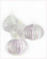
Subtle Flavorby FirstyComment by mycelium: i love the high-key treatment you have given this image. the narrow DOF and the bright-but-not-quite-white background combine with the apparently floating onions to make an intriguing and surreal photograph.
this looks like it was tough to compose. hard to balance the white space with the far-right focal point. i feel like the image may be a tiny bit squeezed on the left. |
| Photographer found comment helpful. |
Home -
Challenges -
Community -
League -
Photos -
Cameras -
Lenses -
Learn -
Help -
Terms of Use -
Privacy -
Top ^
DPChallenge, and website content and design, Copyright © 2001-2026 Challenging Technologies, LLC.
All digital photo copyrights belong to the photographers and may not be used without permission.
Current Server Time: 07/22/2026 06:36:18 PM EDT.