| Image |
Comment |
| 06/17/2003 01:21:24 PM |
Life Saverby AnnidaComment by buck4free: I like the compositino and subject, the colors, especially the water, are a little too drab for my taste. |
 Photographer found comment helpful. Photographer found comment helpful. |
| 06/16/2003 07:17:12 PM |
Life Saverby AnnidaComment by carolee: This photo is interesting, but (whether deliberate or not), I find it difficult to get my bearings looking at it. The background is so plain, I can't tell if this was thrown in the air or is floating on water. I find that unsettling. |
| Photographer found comment helpful. |
| 06/16/2003 10:25:05 AM |
Life Saverby AnnidaComment by alanfreed: I like it! One thing that immediately makes it interesting to me is that I can't tell whether this is sitting in the water, being thrown in the air, or is just sitting on a blue background. Neat, simple shot. |
| Photographer found comment helpful. |
| 06/16/2003 04:42:26 AM |
Life Saverby AnnidaComment by JPR: im trying to figure out if this is in water, on the ground, or being tossed in the air. nice subtle shades of blue. |
| Photographer found comment helpful. |
| 05/07/2003 02:49:55 PM |
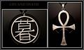
Two Different Languagesby AnnidaComment by inspzil: Greetings from the Critique Club
By Inspzil
Composition - I really like the 2 charms on the necklaces. It's not a photo I would have even thought to do, but it really works. The little symbol on your computer case worked well as a common background for both. They both look like they are supposed to be there. That was a great idea. Good strong composition for both images, but especially together.
Technical - I like the greyscale idea. That makes them look classically old. The only thing is I wish they were sharpened one more time before you submitted. I do fear it a little though. You may have tried it and it didn't work well for you. The reason I fear it on the first one is because there is a little too much light on your background and that can really play hell with the sharpen feature in PS as it will bring all the little tiny white dots of light on the case and bring them to the forefront, making them look like a heavy coat of white dust on the background. Other than that, I think the exposure and framing and all that look good.
Overall - This is a nice image as is. But what I would've tried to do is put a little gleam of light or something on the "life" symbol to make it a little more symbolic and to catch the viewer's eye a little more. As it is, it's a bit flat. The ankh I might darken down a little for the symbolic thing, but it looks pretty good as is. I like this picture and I'm glad it made it in your top 4. Nice job and good luck - Bob |
| Photographer found comment helpful. |
| 05/05/2003 04:20:29 PM |
Two Different Languagesby AnnidaComment by Azrifel: Great pic Annida,
Good idea to use this background with the jewelery. Also like the idea of Death vs Life, the mix of cultures, the dark vs silver and the whole composition.
One improvement could be to take off the carrying rope off and perhaps even to grind the hanging eyes off the top.
It was one of my favs.
I'll take the Ankh if you don't mind. :)
|
| Photographer found comment helpful. |
| 05/04/2003 11:31:30 PM |
|
| Photographer found comment helpful. |
| 05/02/2003 01:31:34 AM |
Two Different Languagesby AnnidaComment by dsidwell: Really engaging and fascinating juxaposition here, and your bold and simple approach really works well. Not quite sharp on my monitor, but what great work! |
| Photographer found comment helpful. |
| 05/01/2003 11:40:57 PM |
|
| Photographer found comment helpful. |
| 04/30/2003 10:58:30 PM |
Two Different Languagesby AnnidaComment by DennisF: Good composition with the different size and aspect images. The metal is handled well - shiny, but not too shiny. Text coul dhave stood out more, IMO. |
| Photographer found comment helpful. |
Home -
Challenges -
Community -
League -
Photos -
Cameras -
Lenses -
Learn -
Help -
Terms of Use -
Privacy -
Top ^
DPChallenge, and website content and design, Copyright © 2001-2026 Challenging Technologies, LLC.
All digital photo copyrights belong to the photographers and may not be used without permission.
Current Server Time: 07/16/2026 02:00:43 AM EDT.