| Image |
Comment |
| 08/01/2017 02:08:36 AM |
|
 Photographer found comment helpful. Photographer found comment helpful. |
| 08/01/2017 12:40:37 AM |
|
| Photographer found comment helpful. |
| 07/31/2017 01:52:14 AM |
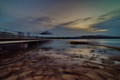
Dream vacationby AmberkhimComment by Amberkhim: Hi Susan,
Thank you for this critique. It's very helpful as it will help in my overall improvement.Thanks again.
Originally posted by snaffles:
Greetings from the Critique Club!
What a location, and yes it does look like a dream spot for sure...and the hunky guy's presence doesn't hurt either :-) Great depth of field to show off that spectacular scenery and the lighting is perfect for catching all those wonderful tropical-destination blues and greens. Some bleachiness in the clouds, always a pet peeve of mine, but not enough to be a huge distraction. So why didn't this image do better? I think the composition needs improvement. Shooting down at your focal point, the man, almost seems to downplay his role in the pic. I feel that he is competing with the scenery, not being complemented by it. A lower angle may have brought him into more prominence without losing the rest of the scene. And strictly fwiw I would have cropped the image more, either as a square and done away with the second body of water to the right, or cropped out the top third and got rid of the majority of the sky. Especially as landscapes are popular FS subjects, we see an awful lot of them here, so you really need a stunning one to do well in FS.
Hope this critique has been of help, feel free to PM me with any comments or questions.
Susan |
|
| 07/16/2017 09:26:48 AM |
Dream vacationby AmberkhimComment by snaffles: Greetings from the Critique Club!
What a location, and yes it does look like a dream spot for sure...and the hunky guy's presence doesn't hurt either :-) Great depth of field to show off that spectacular scenery and the lighting is perfect for catching all those wonderful tropical-destination blues and greens. Some bleachiness in the clouds, always a pet peeve of mine, but not enough to be a huge distraction. So why didn't this image do better? I think the composition needs improvement. Shooting down at your focal point, the man, almost seems to downplay his role in the pic. I feel that he is competing with the scenery, not being complemented by it. A lower angle may have brought him into more prominence without losing the rest of the scene. And strictly fwiw I would have cropped the image more, either as a square and done away with the second body of water to the right, or cropped out the top third and got rid of the majority of the sky. Especially as landscapes are popular FS subjects, we see an awful lot of them here, so you really need a stunning one to do well in FS.
Hope this critique has been of help, feel free to PM me with any comments or questions.
Susan Message edited by author 2017-07-16 09:29:40. |
| Photographer found comment helpful. |
| 06/08/2017 09:59:26 AM |
|
| 06/08/2017 09:57:55 AM |
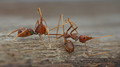
Mimicryby AmberkhimComment by Amberkhim: Originally posted by Lydia:
7 from me. Although, I'm not sure what's going on here... :D It's fascinating to investigate. |
Thank you,Lydia.
The weaver ant is the prey while the predator is an ant- mimicking spider. |
| 06/08/2017 01:14:17 AM |
|
| Photographer found comment helpful. |
| 06/07/2017 01:09:17 PM |
|
| Photographer found comment helpful. |
| 06/06/2017 11:57:24 AM |
Mimicryby AmberkhimComment by Lydia: 7 from me. Although, I'm not sure what's going on here... :D It's fascinating to investigate. |
| Photographer found comment helpful. |
| 02/21/2017 11:20:13 PM |
|
| Photographer found comment helpful. |
Home -
Challenges -
Community -
League -
Photos -
Cameras -
Lenses -
Learn -
Help -
Terms of Use -
Privacy -
Top ^
DPChallenge, and website content and design, Copyright © 2001-2026 Challenging Technologies, LLC.
All digital photo copyrights belong to the photographers and may not be used without permission.
Current Server Time: 05/05/2026 06:09:22 PM EDT.