| Image |
Comment |
| 09/11/2006 12:53:02 AM |
|
 Photographer found comment helpful. Photographer found comment helpful. |
| 09/04/2006 10:05:50 AM |
|
| Photographer found comment helpful. |
| 09/04/2006 04:18:28 AM |
|
| Photographer found comment helpful. |
| 04/25/2006 03:05:17 PM |
|
| Photographer found comment helpful. |
| 04/24/2006 01:07:18 PM |
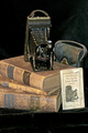
Memoriesby pmichaudComment by melismatica: Nice set-up.I'm not crazy about the lighting which looks rather flat. There are too many glares, especially in the velvet at the bottom. I suggest lighting from the side to add more drama and contrast. This looks somewhat literal to me. |
| Photographer found comment helpful. |
| 04/22/2006 04:00:20 PM |
|
| Photographer found comment helpful. |
| 04/20/2006 12:26:23 AM |
Memoriesby pmichaudComment by Count: Wish some of the space was cropped out of the bottom, otherwise I really like this. Its in my top 20. |
| Photographer found comment helpful. |
| 04/19/2006 10:40:52 PM |
Memoriesby pmichaudComment by yantski: I like the idea of the composition. I think the camera and the manual being almost parallel to each other takes away from the "random" placement though. |
| Photographer found comment helpful. |
| 04/18/2006 10:15:17 PM |
|
| Photographer found comment helpful. |
| 04/15/2006 11:11:08 PM |
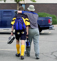
Brothersby pmichaudComment by I Enjoy Ham: Hola from the critique club.. :)
ok, im gonna start off by telling you this is a good image for something taken in 2002. When one enters a challenge such as best of 2002 one must consider the caliber of person he is going up against. Many of the people on dpc are professional's, this considered many of them probably had dSLR's in 2002.
Now to the image. Not to be artsy and critical but composition lacks, mainly because you didnt follow the rule of thirds, i know this is a snapshot but that would have boosted your score i little. I also think that you could have eddited this a little bit more in order to make the subject 'pop' more. i say this because in order for the photograph to be succesfull it must possess a main subject, in this photograph the lighting was flat, causing everything to look the same.
I understand that this is just a snapshot, and that you weren't really taking into acount the rule of thirds and the lighting and such, but in order to score well here, you have to do that, even if it is just a snapshot.
if you have any comments or questions please feel free to PM me. :)
hope i helped,
-Dan |
| Photographer found comment helpful. |
Home -
Challenges -
Community -
League -
Photos -
Cameras -
Lenses -
Learn -
Help -
Terms of Use -
Privacy -
Top ^
DPChallenge, and website content and design, Copyright © 2001-2026 Challenging Technologies, LLC.
All digital photo copyrights belong to the photographers and may not be used without permission.
Current Server Time: 07/20/2026 12:49:38 AM EDT.