| Image |
Comment |
| 01/13/2005 03:42:01 AM |
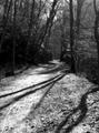
Long and Winding Roadby TranquilComment by alien2thisworld: Hello from the Critique Club,
General Comments:
I really like this shot. It is a little more busy than I normally enjoy, but I think that all the shadows and lighting are quite appropriate for this challenge since it helps hide the 2 figures on the path. I see some people didn't like the fact you had 2 people instead of just one, but I don't hold that against this shot too much.
Lighting:
I really enjoy the harsh lighting and shadows in this shot. Some of the trees look good semi-silhouetted along the path.
Focus/Depth of Field:
Great sharp focus over the whole photo. I think it serves the shot well since specific focus is normally used to draw attention to a subject within it's environment.
Composition:
I like this composition a lot. The trees leaning out over the trail help dull what could possibly otherwise be a distracting overexposed sky. I like the amount of the path shown, since the shadows in the foreground are interesting, and the two figures are right at the end of the visible path.
Color:
This type of shot screams for black and white, and I think it looks supurb. I agree with your own comments, that color would just be distracting here.
Keep up the good work!
-Daniel Message edited by author 2005-01-14 06:37:31. |
 Photographer found comment helpful. Photographer found comment helpful. |
| 01/12/2005 04:33:45 PM |
|
| Photographer found comment helpful. |
| 01/12/2005 04:27:30 PM |
|
| Photographer found comment helpful. |
| 01/12/2005 12:56:07 PM |
|
| Photographer found comment helpful. |
| 01/12/2005 03:24:36 AM |
|
| 01/12/2005 01:09:32 AM |
Mystic Riverby TranquilComment by fotodude: awsome shot i absoultly lov this shot and the technique.
wonderful i hope u get a ribon for this 10 |
| Photographer found comment helpful. |
| 01/11/2005 11:27:45 PM |
|
| Photographer found comment helpful. |
| 01/11/2005 01:05:46 PM |
|
| Photographer found comment helpful. |
| 01/09/2005 03:01:02 AM |
I'm Going Slightly Madby TranquilComment by Bear_Music: *** CRITIQUE CLUB COMMENT ***
This is a beautiful image and well deserves it's high finish in the challenge. The "face" itself is almost startlingly whimiscal and appealing.
Looking at it as a B/W print, I see a lack of detail in the darkest areas that might profitably be fixed, if the information is in the exposure. Speaking in zone system terms, you have a lot of "zone 2" areas that could be raised to "zone 3" (the zone of minimal shadow detail) to the enhancement of the image. this is particularly true where the cover plate falls off into the background in the lower corners and on the right edge a thrid of the way up. A hint of separation of plate from BG would be a plus in these spots.
Otherwise, the tonalities on the plate itself are wonderfully rich and tactile.
From a compositional perspective, I think it's a little TOO balanced top-and-bottom. I'd prefer to see a smifgen removed from the top and added to the bottom, in much the same way that we matte prints with a bit more space below than above.
Great picture, and a pleasure to comment upon.
Robt.
|
| Photographer found comment helpful. |
| 01/07/2005 10:59:43 PM |
|
| Photographer found comment helpful. |
Home -
Challenges -
Community -
League -
Photos -
Cameras -
Lenses -
Learn -
Help -
Terms of Use -
Privacy -
Top ^
DPChallenge, and website content and design, Copyright © 2001-2026 Challenging Technologies, LLC.
All digital photo copyrights belong to the photographers and may not be used without permission.
Current Server Time: 07/23/2026 11:42:35 PM EDT.