| Image |
Comment |
| 09/10/2005 08:21:46 PM |
|
 Photographer found comment helpful. Photographer found comment helpful. |
| 09/10/2005 07:51:08 AM |
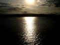
Into the sunby kevrobertsonComment by marklovell: Think I recognise this skyline! Nice compsition, possibly a little noisy, and I would prefer to see a smoother sea by using a smaller aperture. It would also reduce the flare from the sun and could deepen the colours a little. Nice! 10. |
| Photographer found comment helpful. |
| 09/10/2005 01:17:21 AM |
|
| Photographer found comment helpful. |
| 09/09/2005 06:19:29 AM |
self-1.jpgby kevrobertsonComment by marklovell: The composition for me is not great. Tripod constraints notwithstanding, I would consider recomposing with the camera up and right from the H&S statement (in shot but out of focus), making the Tallescope partt of the picture but more of a frame than a feature, provided you can find a nice clean bit of floor (you could always sling ablck on the floor?) - I've seen that stage! (It would also give you a chance to get a close up on the nuts and fixings on the tallescope which could be kinda interesting).
I'm also not sure about the lighting colour - from the highlight on your arms and the tallescope it looks kinda like a yellow/orange - I'm wondering whether a pink would work a little better (sorry all non technicians here, but something like Lee 036?)
Your expression is a little more 'open' in "self-2", but here seems almost forbidding.
Good attempt, I hate doing self portraits! |
| Photographer found comment helpful. |
| 09/09/2005 06:01:32 AM |
self-2.jpgby kevrobertsonComment by marklovell: I concur about the lighting. The red is too dominating and close to you, and the white (IMO) could be better used maybe lighting some fresnels or sthg...
I'm also not sure about the Cyclorama backdrop - given that most of that is dark anyway, why not use a full black?
The pose is good, although I would consider moving the camera further to the left to (a little) more of you.
It'd look great in a catalogue tho....
Edit: typo Message edited by author 2005-09-09 06:02:16. |
| Photographer found comment helpful. |
| 09/08/2005 08:59:11 PM |
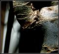
Branching outby kevrobertsonComment by rwouthuis: Very nice lighting and good texture! I think I would have done a different composition so that the branch point wasn't so centred. |
| Photographer found comment helpful. |
| 09/08/2005 08:48:34 PM |
|
| Photographer found comment helpful. |
| 09/08/2005 06:44:02 PM |
self-1.jpgby kevrobertsonComment by rjkstesch: I don't feel the same connection with this shot. Your expression is more closed, the raised elbow is awkward and the signs on the equipment detract from you. I am curious about the use of this equipment. What do you do with it? |
| Photographer found comment helpful. |
| 09/08/2005 06:40:11 PM |
self-2.jpgby kevrobertsonComment by rjkstesch: I like your expression in this shot and your interaction with the equipment. The lighting is off in that the large red light on the left dominates - it could be cloned out or tamed down. The white light in the upper right is distracting - again cloning out would work. The strong reflections on the upper equipment are again pulling us away from your portrait. They could be toned down. I like the red lighting on you very much. It creates a wonderful mood. You may be able to crop this to create a better balanced composition. Try taking some off the left and top. I also like the perspective on this shot. Very strong and "manly." |
| Photographer found comment helpful. |
| 09/08/2005 12:34:26 PM |
|
| Photographer found comment helpful. |
Home -
Challenges -
Community -
League -
Photos -
Cameras -
Lenses -
Learn -
Help -
Terms of Use -
Privacy -
Top ^
DPChallenge, and website content and design, Copyright © 2001-2026 Challenging Technologies, LLC.
All digital photo copyrights belong to the photographers and may not be used without permission.
Current Server Time: 07/22/2026 08:52:12 AM EDT.