| Image |
Comment |
| 10/25/2004 11:31:08 AM |
|
 Photographer found comment helpful. Photographer found comment helpful. |
| 10/25/2004 08:33:19 AM |
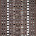
Window Linesby kevrobertsonComment by redmoon: this would make a great album sleeve - actually, it has strong reminisces of a led zeppelin cover. anyway, i do like the symmetry and repitition in this A lot. regards to fitting the challenge, i can't decide if the lines are implied or not... i think the white ones are, but the beige ones are not. so, yes, it fits. i do wsh it were a little bit sharper though. 7. |
| Photographer found comment helpful. |
| 10/25/2004 07:25:53 AM |
Window Linesby kevrobertsonComment by _wu_: So sad, I can't look. Yet it reminds me of my childchood.
Bliliant idea. Quality not as high, but still i have to give it an 8 |
| Photographer found comment helpful. |
| 10/25/2004 06:26:08 AM |
Window Linesby kevrobertsonComment by Justin Evans: This is an interesting idea, but the composition is far too sloppy. Since this piece of architecture is symmetrical, level & plump then that should be reflected in the photo. The hint of windows on the far right edge and the uneven cropping of the very top and bottom windows hurts the picture, in my opinion. Lastly, it's far too "flat." The same shot could be done at a different time of day when the light is far more interesting. That would result in a far better picture. As is, it's very neutral...and neutrality is great for the Swiss but lousy for art. |
| Photographer found comment helpful. |
| 10/25/2004 01:06:08 AM |
Window Linesby kevrobertsonComment by TabbyCat: Very nice! I feel dizzy just looking at this picture. ;-) Not sure if you did anything to make the colors subtle but I think it needs a little color to give it some life or impact. But then again it looks awesome just the way it is, especially with the vertical lines. Way to go! |
| Photographer found comment helpful. |
| 10/25/2004 12:49:51 AM |
Window Linesby kevrobertsonComment by Neil: Good idea (I had a similar idea, shot it, but didn't use it, and this is better anyway). It would have been nice to perspective correct it and square it off a bit (see the top of the shot). Or maybe not perspective and bad architecture ;) |
| Photographer found comment helpful. |
| 10/23/2004 04:36:04 PM |
|
| Photographer found comment helpful. |
| 10/23/2004 07:31:25 AM |
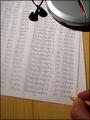
Lines Againby kevrobertsonComment by Artan: I find an image has more impact if it looks like you are actually writing the note.
Your pen is resting on on the first S and looks too staged for me.
I would have stoped half way through the last row, and rested my pencil at the end of the stoke for that letter |
| Photographer found comment helpful. |
| 10/23/2004 06:05:22 AM |
Lines Againby kevrobertsonComment by kiwinick: you naughy photographer you, Did you get a flash of brilliance , love the humour well done go to the top of the class 8 |
| Photographer found comment helpful. |
| 10/23/2004 02:23:51 AM |
|
| Photographer found comment helpful. |
Home -
Challenges -
Community -
League -
Photos -
Cameras -
Lenses -
Learn -
Help -
Terms of Use -
Privacy -
Top ^
DPChallenge, and website content and design, Copyright © 2001-2026 Challenging Technologies, LLC.
All digital photo copyrights belong to the photographers and may not be used without permission.
Current Server Time: 07/18/2026 06:02:12 PM EDT.