| Image |
Comment |
| 01/30/2005 08:12:54 AM |
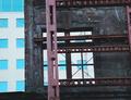
untitledby kevrobertsonComment by vadvirag: Not bad, maybe a bit overexposed (the building in the background), but it helps the opposite. For me, this shot cries for a symmetrical composition. Compose the "window" of the old one to the new to the center, if you feel the shot this way boring, rotate it it a bit, but leave it centered. Simple subjects need simple, but not ad-hoc compositions to work well.
I see you din't give a title. "Window to the new" or something like that came to my mind when I saw your shot. Feel your photo! If you couldn't find a title, you didn't feel it enough. |
 Photographer found comment helpful. Photographer found comment helpful. |
| 01/29/2005 02:52:46 PM |
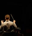
Empty Orchestraby kevrobertsonComment by AprilTheatreGeek: I understand that maybe there should be some blurring of his hands and arms due to movement because he's conducting but the rest of the photo is not in focus and the lighting could have been better. Also the photo looks a little yellow, maybe fix the color balance and composition-wise I think I would rather have seen him standing. Otherwise a very good idea! I was immediately drawn to the thumbnail. |
| Photographer found comment helpful. |
| 01/29/2005 02:45:50 PM |
|
| Photographer found comment helpful. |
| 01/28/2005 05:01:42 PM |
|
| Photographer found comment helpful. |
| 01/27/2005 06:46:56 PM |
Waitingby kevrobertsonComment by ahaze: The sharpening here is odd. The columns and shoes look oversharp but the face and shirt look soft. Nike even appears to have some motion blur. I like the composition, but I think I would have taken another shot at it. |
| Photographer found comment helpful. |
| 01/26/2005 01:59:35 AM |
|
| Photographer found comment helpful. |
| 01/26/2005 12:20:09 AM |
|
| Photographer found comment helpful. |
| 01/25/2005 08:36:48 AM |
Waitingby kevrobertsonComment by Skip: what an interesting image. you have really captured the essence of a moment in an image that really opens the door for imagination. i hope this is getting the attention it deserves, and it not being overlooked in this colossal challenge. good luck here, and in the challenges yet to come! |
| Photographer found comment helpful. |
| 01/25/2005 03:29:03 AM |
Post modernby kevrobertsonComment by ubique: I like this image very much & have no real idea why. It simply looks appealing and somehow harmonious. Sorry I am letting you down on the comments side, but I'm nevertheless scoring it an 8. |
| Photographer found comment helpful. |
| 01/24/2005 09:13:32 PM |
|
| Photographer found comment helpful. |
Home -
Challenges -
Community -
League -
Photos -
Cameras -
Lenses -
Learn -
Help -
Terms of Use -
Privacy -
Top ^
DPChallenge, and website content and design, Copyright © 2001-2026 Challenging Technologies, LLC.
All digital photo copyrights belong to the photographers and may not be used without permission.
Current Server Time: 07/19/2026 08:13:19 AM EDT.