| Image |
Comment |
| 07/21/2005 10:46:18 AM |
|
 Photographer found comment helpful. Photographer found comment helpful. |
| 07/20/2005 04:14:46 PM |
|
| Photographer found comment helpful. |
| 07/20/2005 03:26:54 PM |
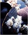
Clam upby kevrobertsonComment by sabphoto: Fits challenge=5
Color/lighting=1
DOF/focus=1
Wow factor/uniqueness=0
Attractiveness=0
Interesting. Focus seems soft on the barnicles but not the black shell, might need a slight adjustment there. Good depth of field otherwise.
Good luck |
| Photographer found comment helpful. |
| 07/20/2005 12:57:58 AM |
|
| Photographer found comment helpful. |
| 07/19/2005 06:57:04 PM |
|
| Photographer found comment helpful. |
| 07/17/2005 10:45:01 PM |
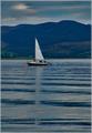
Wherever...Wheneverby kevrobertsonComment by srbrubaker: There's a strange and creepy blueness that swamps the photo. And the red and green seem too intensly saturated too. It seems to me that the textures and shapes might make this photo more than than colors, in which case B&W might make for a stronger presentation. |
| Photographer found comment helpful. |
| 07/17/2005 08:01:16 PM |
Wherever...Wheneverby kevrobertsonComment by Konador: This could have been quite a nice shot but I think it was ruined by post processing. There is no dynamic range, all the brightness is too similar, with no real highlights and no real shadows, and a blue cast over eveything. I think it would look much better in B&W with the contrast much higher. |
| Photographer found comment helpful. |
| 07/17/2005 11:55:05 AM |
|
| Photographer found comment helpful. |
| 07/07/2005 12:39:04 AM |
|
| Photographer found comment helpful. |
| 07/06/2005 04:11:35 AM |
|
| Photographer found comment helpful. |
Home -
Challenges -
Community -
League -
Photos -
Cameras -
Lenses -
Learn -
Help -
Terms of Use -
Privacy -
Top ^
DPChallenge, and website content and design, Copyright © 2001-2026 Challenging Technologies, LLC.
All digital photo copyrights belong to the photographers and may not be used without permission.
Current Server Time: 07/23/2026 02:54:25 AM EDT.