| Image |
Comment |
| 05/11/2006 11:23:15 PM |
001.jpgby eostylesComment by sabphoto: ditto on what the others have said. I feel if you're going to do the double image sort of thing maybe use two different images and show the ghost one just a bit more. I kind of like the style where one picture is in the corner and the other is full page, but I like that you are trying something different.
Keep it up. |
 Photographer found comment helpful. Photographer found comment helpful. |
| 05/11/2006 10:12:24 PM |
002.jpgby eostylesComment by L2: I'm with Rikki here, grain doesn't seem effective with this pose and subject. It's not a "gritty" type shot... I'm not sure if that makes any sense. Composition is good here. |
| Photographer found comment helpful. |
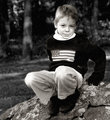
| 05/11/2006 10:09:43 PM |
001.jpgby eostylesComment by L2: Yay for trying something new! Not sure about the ghosting effect. I think it needs to be a different expression, a la 1987 senior portraits, or more noticeable or something. It seems to throw off the composition a little bit. Lighting seems kinda harsh as well, with stark shadows cast by the hand and on the face -- doesn't go with facial expression. Super cute kid, though. |
| Photographer found comment helpful. |
| 05/11/2006 09:57:00 PM |
001.jpgby eostylesComment by Elvis_L: I would agree with Rikki i feel if you are going to selective desat then make the color left really stand out |
| Photographer found comment helpful. |
| 05/11/2006 09:53:18 PM |
002.jpgby eostylesComment by Rikki: Digital grain? While the noise + grain is good and I don't mind it, it's not quite as effective here as there are areas where the lighting is bright and somewhat blown out. Grain looks great in areas where it isn't too white. Does that make any sense? |
| Photographer found comment helpful. |
| 05/11/2006 09:51:38 PM |
001.jpgby eostylesComment by Rikki: Interesting PP style here. If this is a selective desat then I would bump up the pink bow so it's a bit more evident. The ghosting effect is ok but I'm not too thrilled about it ;) |
| Photographer found comment helpful. |
| 05/10/2006 04:56:22 AM |
Gone Fishin!by eostylesComment by owen: This is great. Getting the 2 like that on the plain background really stands out. |
| Photographer found comment helpful. |
| 05/09/2006 09:46:42 PM |
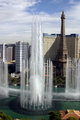
Part of View from Window 01.jpgby eostylesComment by tinky2: Las Vegas! I like how the fountain and tower are the same size. The sky is great. I sort of visually played with cropping out some of the bottom but couldn't make it work so I see why you left it. |
| Photographer found comment helpful. |
| 05/09/2006 09:36:36 PM |
Tulips 03by eostylesComment by trnqlty: Well I don't see a tree but I suppose you already fixed it. Nice powerfull colors and almost unrealistic but, in a really cool way. Good choice darkening the sky to help make the flowers pop more. Did you use a small gradient filter up top to get that nice fall off? If so good choice, that's one of my favorite ways to add interest and dynamic to a flat background. |
| Photographer found comment helpful. |
| 05/09/2006 09:36:05 PM |
036 - small.jpgby eostylesComment by Jutilda: Oh my goodness. This is absolutely wonderful. Unusual and each child has his/her own frame. Truly a great image with wonderful emotion, contrast, content, etc, etc. |
| Photographer found comment helpful. |
Home -
Challenges -
Community -
League -
Photos -
Cameras -
Lenses -
Learn -
Help -
Terms of Use -
Privacy -
Top ^
DPChallenge, and website content and design, Copyright © 2001-2026 Challenging Technologies, LLC.
All digital photo copyrights belong to the photographers and may not be used without permission.
Current Server Time: 07/17/2026 02:38:09 AM EDT.