| Image |
Comment |
| 03/04/2003 10:02:13 AM |
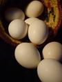
Eggs & Indian Basketby KathycComment by 3boyzMom: Really nice still life...my only complaint is the texture of that one egg that has the bumps on it...i probably would have chosen a smoother egg for that high profile position in your composition. i like the natural colors and your lighting is nice. probably would be better with a little sharper focus, especially on the eggs in front. |
| 03/03/2003 09:56:29 PM |
|
| 03/03/2003 07:52:07 PM |
Eggs & Indian Basketby KathycComment by Jeileen: Nice picture. The angle make me initally think the eggs are flying out of the basket. After looking at it for a minute - I get that maybe the eggs are placed in front of a basket laying on its side. Maybe a different angle would work. |
| 02/02/2003 10:22:07 PM |
|
| 02/02/2003 04:46:39 PM |
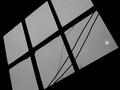
Window & Lightby KathycComment by PTLParsons: Two questions; 1) what is the white spot in the corner of the bottom pane? 2) why the angle of the window? I love the tips of the bushes at the bottom of the window. Blast those wiress. Shame all utilities aren't buried. Nice choice of B & W. |
| 02/02/2003 02:11:05 PM |
Window & Lightby KathycComment by lisae: Interesting. I like the rakish angle of this and the very simple grey on black tones. |
| 02/01/2003 06:49:42 PM |
Window & Lightby KathycComment by Gracious: I like the simplicity of this. I think it would be better without the light though. But that's just me. Very nice perspective. |
| 01/30/2003 12:43:58 PM |
Window & Lightby KathycComment by FranziskaLang: challenge met. i'm assuming that you were going for the more abstract look here, and you got close. b&W works well for that , and you have achieved very nice black in the background. there are a couple of things that you've probably included deliberately (cracks, powerlines), that i personally find a bit distracting. most of all the trees that are visible at the bottom of the window, they detract from the abstractness (is there such a word?) of it all i think. sorry. |
| 01/30/2003 12:07:36 PM |
Window & Lightby KathycComment by karmat: I like the stark contrast between the black and gray, however, I think the composition itself comes up a little flat. Maybe if the light was a little more pronounced or definite, it would help. |
| 01/29/2003 11:53:00 PM |
Window & Lightby KathycComment by Turbotech: I am wondering what I can say about this. The potential is there. Something is missing. Can not put a finger on it. |
Home -
Challenges -
Community -
League -
Photos -
Cameras -
Lenses -
Learn -
Help -
Terms of Use -
Privacy -
Top ^
DPChallenge, and website content and design, Copyright © 2001-2026 Challenging Technologies, LLC.
All digital photo copyrights belong to the photographers and may not be used without permission.
Current Server Time: 05/06/2026 01:05:02 PM EDT.