"O"by
elsapoComment by HBunch: *Critique Club*
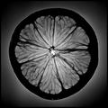
While this is a very nice photo, I guess I am not drawn into it quite as much as most of the voters.
I find the bright outline around the very edge of the lemon to be odd and actually makes it look like it was cut and pasted. I'm not saying it was...just kind of looks that way with the combination of the gradient background and the glow around the edge of the lemon.
The focus and clarity are wonderful. Stunning detail with the veins. For the challenge, I see the importance of having the entire slice of the lemon in the photo, but I think that outside the challenge, I would like to see this as not so centered. Maybe fill just the upper left corner with 1/4th of the lemon or something. Just an idea.
I like the black and white because I think that it helps bring out the texture/detail in the veins, but can't help but wonder what this would look like with some color.
Overall a very nice pic with awesome detail and fits the challenge, but I'm not totally drawn in.
~Heather~
Edit to add that when I viewed this photo from the thumbnail in your profile, I could not see the bright ring around the very outside of the lemon, and this did have higher visual appeal (in that aspect) from the thumbnail.
Message edited by author 2005-04-18 00:49:59.