| Image |
Comment |
| 10/05/2005 11:22:50 AM |
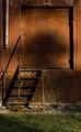
Red Vs Greenby jmleliiComment by ClickNSee: Gotta tell ya, I'm havin a hard time buying that 'Red', but I'm gonna give ya the benefit of the dought. Very nice image, otherwise. <8> |
 Photographer found comment helpful. Photographer found comment helpful. |
| 10/05/2005 03:20:20 AM |
Red Vs Greenby jmleliiComment by RichSeal: I really like this shot, love the composiion. But for the challenge the colors don't stand out enough for me. |
| Photographer found comment helpful. |
| 09/22/2005 01:10:59 PM |
Onlooking...by jmleliiComment by DogAngel: Hey there! I can't belive this one ended up with a grade that low, I really liked it and gave it a 7! :) The only thing I don't like is the way her arm is alot tannner then the rest of her body and the shadows on her face are a tiny bit harsh (ai I'd love to see the eyes a tiny bit better!) but overall a good pic, and unfair score! |
| Photographer found comment helpful. |
| 09/22/2005 06:29:48 AM |
Onlooking...by jmleliiComment by mpemberton: I think it is a great photograph. The only thing I would change is the flooring. It does not match with the wall. |
| Photographer found comment helpful. |
| 09/21/2005 09:00:58 PM |
Onlooking...by jmleliiComment by strangeghost: Greetings from the Critique Club
by strangeghost
COMPOSITION
I think this is a masterful composition. Off-center, perfect sense of how to place your subject in the image, wonderful use of negative space, etc. The whole photo does what all great shots should do, it occupies my mind as well as my senses. The lighting from the left as she looks off to the right is beautiful. I like the low light level and the wonderful interplay of shadow and illumination that is created on her body and the deeply textured wood wall.
TECHNIQUE
I can't find any nits to pick here. You've achieved a wonderfully expressive photo with great detail and texture throughout. I love your lighting and the broad range of tonality. This is a photo that defies technical critique so I'm going to let it speak for itself. Reader, look at the picture!
OVERALL IMPACT
As I hope you've sensed, I like this picture a lot. I think its sheer emotional impact is very high. It's a photo that seems to raise questions and make me wonder who she is, why she looks so somber, what's happening here. In a word, she suggests a story and sets the imagination to work. I'm frankly stymied by your score. Did people think there wasn't enough color (as your photographer's comment suggests)? Did they not think a full body shot qualifies as a portrait?
I figured there would be a lot of complaints about the grain, but IMO, that was a very necessary part of this image. Low light creates mood and the grain really adds to the mood. Correct decision on your part. This was a superb photo Jeremy and I really hope you are still happy with it. Voters come with their own idea of what's good and what's not, but a great photo will stand on its own long after the challenge is forgotten. I thoroughly enjoyed studying this image in detail. |
| Photographer found comment helpful. |
| 09/18/2005 09:57:38 PM |
An old treeby jmleliiComment by Neuferland: Greetings from the Critique Club!
Wow! That was my first impression when I saw this come out of the que. This is an amazing shot. Then I saw your score and said, "WHAT THE ????"
This is an amazing shot, the shadows, the tones are all very well done for my taste. I like the border, I immediately thought that this would make a fantastic print.
The only reason I can see why it might not have done as well as I THINK it should have is the bottom could be cropped just a touch more, taking out the root area on the left and the light on the right is just a bit blown out.
But otherwise, WOW!!! Good Job!!
Deannda |
| Photographer found comment helpful. |
| 09/16/2005 04:59:30 PM |
Onlooking...by jmleliiComment by Napalm Nymph: I really like this photo. I love the shadows, the light on her face and her pose. I just don't think it fits the challenge that well. In fact, it almost looks black and white. |
| Photographer found comment helpful. |
| 09/16/2005 03:51:05 AM |
Rise aboveby jmleliiComment by Nitin: Greetings from the critique club
First Impression:
Composition is busy, uncomfortable tilt in the horizon.
Relevance to the challenge:
I see you were trying to contrast the yellow flowers to the blue sky, which is a good idea. It might have helped to boost the yellow saturation to make it stand out more
Composition:
You could've got a nice yellow-blue contrast with a much tighter crop. The trees behind the flowers dont seem to add much to the photograph.
Camera work:
The depth of field appears too deep. A smaller aperture would have been sufficient.
Processing:
The colors are a bit on the dull side. Boosting the saturation woul've helped.
Good luck in future challenges!
|
| 09/16/2005 02:04:01 AM |
|
| Photographer found comment helpful. |
| 09/15/2005 11:31:52 AM |
|
| Photographer found comment helpful. |
Home -
Challenges -
Community -
League -
Photos -
Cameras -
Lenses -
Learn -
Help -
Terms of Use -
Privacy -
Top ^
DPChallenge, and website content and design, Copyright © 2001-2026 Challenging Technologies, LLC.
All digital photo copyrights belong to the photographers and may not be used without permission.
Current Server Time: 07/17/2026 07:28:22 AM EDT.